LVGL Widgets
At the next level of the LVGL object hierarchy are the widgets, which support styling directly. They can have sub-parts, which may be styled separately. Usually styles are inherited, but this depends on widget specifics or functionality. The widget and its parts have states, and different styling can be set for different states.
Widgets can have children, which can be any other widgets. Think of this as a nested structure. The child widgets move with the parent and, if the parent is hidden, its children will also be hidden.
By default, LVGL draws new widgets on top of old widgets, including their children. When widgets have children, property inheritance takes place. Some properties (typically those related to text and opacity) can be inherited from the parent widgets’s styles. When the property is inheritable, the parent will be searched for an object which specifies a value for the property. The parents will use their own state to determine the value. For example, if a button is pressed and the text color is defined by the “pressed” state, this “pressed” text color will be used.
Common properties

The properties below are common to all widgets.
Configuration variables:
- id (Optional, ID): Manually specify the ID used for code generation.
- x (Optional, int16 or percentage): Horizontal position of the widget.
- y (Optional, int16 or percentage): Vertical position of the widget.
ℹ️ Note
By default, the
xandycoordinates are measured from the top left corner of the parent’s content area. Important: content area starts after the padding thus if the parent has a non-zero padding value, position will be shifted with that. Percentage values are calculated from the parent’s content area size.If specifying
align,xandycan be used as an offset to the calculated position (can also be negative). They are ignored if Layouts are used on the parent.
- height (Optional): Height of the widget in pixels or a percentage, or
SIZE_CONTENT. - width (Optional): Width of the widget in pixels or a percentage, or
SIZE_CONTENT.
ℹ️ Note
The size settings support a special value:
SIZE_CONTENT. It means the widget’s size in the respective direction will be set to the size of its children. Note that only children on the right and bottom sides will be considered and children on the top and left remain cropped. This limitation makes the behavior more predictable. Widgets withhiddenorfloatingflags will be ignored by theSIZE_CONTENTcalculation.Similarly to CSS, LVGL also supports
min_width,max_width,min_heightandmax_height. These are limits preventing a widget’s size from becoming smaller/larger than these values. They are especially useful if the size is set by percentage orSIZE_CONTENT.
min_width, max_width, min_height, max_height (Optional, int16 or percentage): Sets a minimal/maximal width or a minimal/maximal height. Pixel and percentage values can be used. Percentage values are relative to the dimensions of the parent’s content area. Defaults to
0%.scrollbar_mode (Optional, string): If a child widget is outside its parent content area (the size without padding), the parent can become scrollable (see the
scrollableflag). The widget can either be scrolled horizontally or vertically in one stroke. Scroll bars can appear depending on the setting:"OFF": Never show the scroll bars (use the double quotes!)."ON": Always show the scroll bars (use the double quotes!)."ACTIVE": Show scroll bars while a widget is being scrolled."AUTO": Show scroll bars when the content is large enough to be scrolled (default).
align (Optional, enum): Alignment of the widget relative to the parent. A child widget is clipped to its parent boundaries. One of the values not starting with
OUT_(see picture below).align_to (Optional, list): Alignment of the widget relative to another widget on the same level:
- id (Required): The ID of a widget to which you want to align.
- align (Required, string): Desired alignment (one of the values starting with
OUT_). - x (Optional, int16 or percentage): Horizontal offset position. Default
0. - y (Optional, int16 or percentage): Vertical offset position. Default
0.

- group (Optional, string): The name of the group of widgets which will interact with a Rotary Encoder Sensor. In every group there is always one focused widget which receives the encoder actions. You need to associate an input device with a group. An input device can send key events to only one group but a group can receive data from more than one input device. If no group is specified for a widget or an encoder, an unnamed default group will be assigned, so in most cases where only one encoder is used it will not be necessary to explicitly specify a group.
- layout (Optional): See Layouts for details. Defaults to
NONE. - styles (Optional, ID): The ID of a style definition from the main component configuration to override the theme styles.
- theme (Optional, list): A list of styles to apply to the widget and children. Same configuration option as at the main component.
- widgets (Optional, list): A list of LVGL widgets to be drawn as children of this widget. Same configuration option as at the main component.
- state (Optional, dict): Widgets or their (sub)parts can have have states, which support separate styling. These state styles inherit from the theme, but can be locally set or overridden within style definitions. Can be one of:
- checked (Optional, boolean): Toggled or checked state.
- disabled (Optional, boolean): Disabled state (also usable with shorthand actions
lvgl.widget.enableandlvgl.widget.disable). - edited (Optional, boolean): Edit by an encoder.
- focus_key (Optional, boolean): Focused via keypad or encoder but not via touch screen.
- focused (Optional, boolean): Focused via keypad or encoder or clicked via touch screen.
- pressed (Optional, boolean): Being pressed.
- scrolled (Optional, boolean): Being scrolled.
- user_1, user_2, user_3, user_4 (Optional, boolean): Custom states.
By default, states are all false, and they are templatable.
To apply styles to the states, you need to specify them one level above, for example:
- button:
    checkable: true
    state:
      checked: true # here you activate the state to be used at boot
    checked:
      bg_color: 0x00FF00 # here you apply styles to be used when in the respective state
The state itself can be can be changed by interacting with the widget, or through actions with lvgl.widget.update.
See Cover status and control for a cookbook example which demonstrates how to use styling and properties to show different states of a Home Assistant entity.
In addition to visual styling, each widget supports some boolean flags to influence the behavior:
- adv_hittest (Optional, boolean): allow performing more accurate hit (click) test. For example, may help by accounting for rounded corners.
- checkable (Optional, boolean): toggle checked state when the widget is clicked.
- click_focusable (Optional, boolean): add focused state to the widget when clicked.
- clickable (Optional, boolean): make the widget clickable by input devices. Defaults to
true. Iffalse, it will pass the click to the widgets behind it (clicking through). - event_bubble (Optional, boolean): propagate the events to the parent.
- floating (Optional, boolean): do not scroll the widget when the parent scrolls and ignore layout.
- gesture_bubble (Optional, boolean): propagate the gestures to the parent.
- hidden (Optional, boolean): make the widget hidden (like it wasn’t there at all), also usable with shorthand actions
lvgl.widget.showandlvgl.widget.hide. Hidden objects are ignored in layout calculations. Defaults tofalse. - ignore_layout (Optional, boolean): the widget is simply ignored by the layouts. Its coordinates can be set as usual.
- layout_1, layout_2 (Optional, boolean): custom flags, free to use by layouts.
- overflow_visible (Optional, boolean): do not clip the children’s content to the parent’s boundary.
- press_lock (Optional, boolean): keep the widget pressed even if the press slid from the widget.
- scroll_chain simple (Optional, boolean): packaging for (
scroll_chain_hor | scroll_chain_ver). - scroll_chain_hor (Optional, boolean): allow propagating the horizontal scroll to a parent.
- scroll_chain_ver (Optional, boolean): allow propagating the vertical scroll to a parent.
- scroll_elastic (Optional, boolean): allow scrolling inside but with slower speed.
- scroll_momentum (Optional, boolean): make the widget scroll further when “thrown”.
- scroll_on_focus (Optional, boolean): automatically scroll widget to make it visible when focused.
- scroll_one (Optional, boolean): allow scrolling only on
snappablechildren. - scroll_with_arrow (Optional, boolean): allow scrolling the focused widget with arrow keys.
- scrollable (Optional, boolean): the widget can become scrollable. Defaults to
true(also see thescrollbar_modeproperty). - snappable (Optional, boolean): if scroll snap is enabled on the parent it can snap to this widget.
- user_1, user_2, user_3, user_4 (Optional, boolean): custom flags, free to use by user.
- widget_1, widget_2 (Optional, boolean): custom flags, free to use by widget.
ℹ️ Note
LVGL only supports integers for numeric
value. Visualizer widgets can’t display floats directly, but they allow scaling by 10s. Some examples in the Cookbook cover how to do that.
Widget parts
Widgets can have multiple parts, each of which can be styled independently. For example, a checkbox has a main part that styles the background and text label, and an indicator part that styles the tick box. All widgets have a main part, the available parts for other widgets are specified in the widget description.
The possible parts are:
- main (Optional, dict): The main part of the widget, i.e. the background. Any style properties applied at the top level of the widget are assumed to apply to this part, but may also be specified under the main config key.
- scrollbar (Optional, dict): The scrollbar styles.
- indicator (Optional, dict): The indicator part of the widget. The indicator part may be used to show tick boxes or other visual indicators in slider, bar or arc.
- knob (Optional, dict): The knob part of the widget e.g. a draggable item in slider, bar or arc.
- selected (Optional, dict): The currently selected part of the widget, e.g. text or the selected item in a roller.
- items (Optional, dict): The items part of the widget, e.g. the items in a roller.
- ticks (Optional, dict): Ticks on scales for a meter.
- cursor (Optional, dict): The cursor part of the widget, e.g. the cursor in a spinbox.
# Example slider with knob and indicator styling
- slider:
    # main (background) styles
    bg_opa: cover
    bg_grad: color_bar
    radius: 0
    indicator:
      bg_opa: transp    # Makes the indicator part invisible
    knob:
      radius: 1
      width: 4
      height: 10%
      bg_color: 0x000000
Widget-specific properties
Some widgets have properties that are specific to that widget. For example label has a text property. The properties
specific to a widget are described in each section below. Some of these properties may also be updated with a corresponding
lvgl.<widget_type>.update action, e.g. lvgl.label.update allows updating not only the common style properties,
but also the text property of a label.
Text property
Several widgets have a text property, and the possible ways this can be specified are common to all text properties.
The text may be a Unicode string or other constant convertible to a string; if the string is enclosed in double quotes "" then
standard escape sequences sucn as newline \n and Unicode codepoints will be translated.
The text value may also be a lambda returning a std::string or may be
specified with a format property utilising printf style formatting. There is also a time_format option
which allows use of strftime formats.
When formatting a single floating point value, it is possible to provide a substitute string to be used when the
value is nan or inf. The substitute string is specified with the if_nan option.
Examples:
# Example label
- label:
    id: label_id
    text: "Text string"
- checkbox:
    id: checkbox_id
    text: "\uF00C"  # Unicode check-mark

on_...:
  - lvgl.label.update:
      id: label_id
      text:
        format: "%d bells, %d things"
        args: [x, 10]  # x is a value from the enclosing trigger.
  - lvgl.label.update:
      id: label_id
      text: !lambda return id(text_sensor).state;
  - lvgl.label.update:
      id: label_id
      text:
        time_format: "%c"   # uses default time component
  - lvgl.checkbox.update:
      id: checkbox_id
      text:
        time_format: "%c"
        time: sntp_id
  - lvgl.label.update:
      id: label_id
      text:
        time_format: "%c"
        time: !lambda return id(sntp_id).utcnow();
  - lvgl.label.update:
      id: value_id
      text:
        format: "%.1f"
        args: [id(sensor_id).state]
        if_nan: "N/A"
animimg
The animation image is similar to the normal image widget. The main difference is that instead of one source image, you set a list of multiple source images. You can also specify a duration and a repeat count.
Configuration variables:
- src (Required, list of images): A list of IDs of existing image configurations to be loaded as frames of the animation.
- auto_start (Optional, boolean): Start the animation playback automatically at boot. Defaults to
true. - duration (Required, Time): Total duration of a playback cycle (each frame is displayed for an equal amount of time).
- repeat_count (Optional, int16 or forever): The number of times playback should be repeated. Defaults to
forever. - Some style options from Style properties for the background rectangle that uses the typical background style properties and the image itself using the image style properties.
Actions:
lvgl.animimg.startaction starts the animation playback if it was displayed withauto_startfalse or afterrepeat_countexpired.- id (Required): The ID or a list of IDs of animimg widgets which you want start.
lvgl.animimg.stopaction stops the animation playback.- id (Required): The ID or a list of IDs of animimg widgets which you want stop.
lvgl.animimg.updateaction can be used to changerepeat_countandduration, just like the lvgl.widget.update action is used for the common styles, states or flags.- id (Required): The ID or a list of IDs of animimg widgets to be updated.
- src (Optional, list of images): A list of IDs of existing image configurations to be loaded as frames of the animation.
- auto_start (Optional, boolean): Start the animation playback automatically after update. Defaults to
true. - duration (Optional, Time): Total duration of a playback cycle (each frame is displayed for an equal amount of time). This will apply to the next playback loop.
- repeat_count (Optional, int16 or forever): The number of times playback should be repeated. Defaults to
forever. - Some style options from Style properties for the background rectangle that uses the typical background style properties and the image itself using the image style properties.
Triggers:
- interaction LVGL event triggers.
Example:
# Example widget:
- animimg:
    align: CENTER
    id: anim_id
    src: [ cat_image, cat_image_bowtie ]
    duration: 1000ms

# Example actions:
on_...:
  then:
    - lvgl.animimg.update:
        id: anim_id
        repeat_count: 100
        duration: 300ms
See Battery charging animation in the Cookbook for a more detailed example.
arc
The arc consists of a background and a foreground arc. The indicator foreground can be touch-adjusted with a knob.

Configuration variables:
- adjustable (Optional, boolean): Add a knob that the user can move to change the value. Defaults to
false. - arc_color (Optional, color): Color used to draw the arc.
- arc_opa (Optional, opacity): Opacity of the arc.
- arc_rounded (Optional, boolean): Make the end points of the arcs rounded.
truerounded,falseperpendicular line ending. - arc_width (Optional, int16): Set the width of the arcs in pixels.
- change_rate (Optional, int8): If the arc is pressed the current value will set with a limited speed according to the set change rate. The change rate is defined in degree/second. Defaults to
720. - end_angle (Optional, 0-360): end angle of the arc background (see note). Defaults to
45. - indicator (Optional, list): Settings for the indicator part to show the value. Supports a list of styles and state-based styles to customize. Draws another arc using the arc style properties. Its padding values are interpreted relative to the background arc.
- knob (Optional, list): Settings for the knob part to control the value. Supports a list of styles and state-based styles to customize. Draws a handle on the end of the indicator using all background properties and padding values. With zero padding the knob size is the same as the indicator’s width. Larger padding makes it larger, smaller padding makes it smaller.
- max_value (Optional, int8): Maximum value of the indicator. Defaults to
100. - min_value (Optional, int8): Minimum value of the indicator. Defaults to
0. - mode (Optional, string):
NORMAL: the indicator is drawn from the minimum value to the current.REVERSE: the indicator is drawn counter-clockwise from the maximum value to the current.SYMMETRICAL: the indicator is drawn from the middle point to the current value. Defaults toNORMAL. - rotation (Optional, 0-360): Offset to the 0 degree position. Defaults to
0.0. - start_angle (Optional, 0-360): start angle of the arc background (see note). Defaults to
135. - value (Optional, int8): Actual value of the indicator at start, in
0-100range. Defaults to0. - Any Styling and state-based option to override styles inherited from parent. The arc’s size and position will respect the padding style properties.
If the adv_hittest flag is enabled the arc can be clicked through in the middle. Clicks are recognized only on the ring of the background arc.
ℹ️ Note
The zero degree position is at the middle right (3 o’clock) of the widget and the degrees increase in a clockwise direction from there. Angles are specified in the
0-360range.
Actions:
lvgl.arc.updateaction updates the widget styles and properties from the specific options above, just like the lvgl.widget.update action is used for the common styles, states or flags.- id (Required): The ID or a list of IDs of arc widgets to be updated.
- value (Optional, int8): New value of the indicator.
- Any Styling and state-based option to override styles inherited from parent. The arc’s size and position will respect the padding style properties.
Triggers:
on_valuetrigger is activated when the arc value changes, either by user interaction or programmatically. The new value is returned in the variablex.on_changetrigger is activated when the arc value is changed by user interaction. The new value is returned in the variablex.- interaction LVGL event triggers which also return the value in
x.
Example:
# Example widget:
- arc:
    x: 10
    y: 10
    id: arc_id
    value: 75
    min_value: 0
    max_value: 100
    adjustable: true

# Example action:
on_...:
  then:
    - lvgl.arc.update:
        id: arc_id
        knob:
          bg_color: 0x00FF00
        value: 55

# Example trigger:
- arc:
    ...
    on_value:
      - logger.log:
          format: "Arc value is: %.0f"
          args: [ 'x' ]
ℹ️ Note
The
on_valueandon_changetriggers are sent as the arc knob is dragged or changed with keys. The event is sent continuously while the arc knob is being dragged; this generally has a negative effect on performance. To mitigate this, consider using a universal interaction trigger likeon_release, to get thexvariable once after the interaction has completed.
The arc can be also integrated as a Number or Sensor component.
See Light brightness slider and Media player volume slider for examples which demonstrate how to use a slider (or an arc) to control entities in Home Assistant.
bar
The bar widget has a background and an indicator foreground on it. The size of the indicator is set according to the current value of the bar.
Vertical bars can be created if the width is smaller than the height.
Not only the end, but also the start value of the bar can be set, which changes the start position of the indicator.
Configuration variables:
- animated (Optional, boolean): Animate the indicator on boot to the starting value. Defaults to
true. - indicator (Optional, int): Settings for the indicator part to show the value. Supports a list of styles and state-based styles to customize, all the typical background properties.
- max_value (Optional, int): Maximum value of the indicator. Defaults to
100. - min_value (Optional, int): Minimum value of the indicator. Defaults to
0. - mode (Optional, string): The mode of the bar. Defaults to
NORMAL.NORMAL: the indicator is drawn from the minimum value to the current value.RANGE: the indicator is drawn from the start value to the current value.SYMMETRICAL: the indicator is symmetrically drawn from the middle point to the current value.
- start_value (Optional, int): For
RANGEmode, the start value of the indicator. Defaults to0. - value (Optional, int): Value for the indicator end, in
min_value-max_valuerange. Defaults to0. - Style options from Style properties. The background of the bar and it uses the typical background style properties. Adding padding will make the indicator smaller or larger.
Actions:
lvgl.bar.updateaction updates the widget styles and properties from the specific options above, just like the lvgl.widget.update action is used for the common styles, states or flags.- id (Required): The ID or a list of IDs of bar widgets to be updated.
- Any of the bar options as listed above.
- Style options from Style properties. The background of the bar and it uses the typical background style properties. Adding padding will make the indicator smaller or larger.
Triggers:
- interaction LVGL event triggers.
Example:
# Example widget:
- bar:
    x: 10
    y: 100
    id: bar_id
    value: 75
    min_value: 1
    max_value: 100

# Example action:
on_...:
  then:
    - lvgl.bar.update:
        id: bar_id
        value: 55
The bar can be also integrated as Number or Sensor component.
button
Simple push (momentary) or toggle (two-states) button.
Configuration variables:
- checkable (Optional, boolean): A significant flag to make a toggle button (which remains pressed in
checkedstate). Defaults tofalse. - Style options from Style properties for the background of the button. Uses the typical background style properties.
A notable state is checked (boolean) which can have different styles applied.
Triggers:
on_changetrigger is activated after clicking. Ifcheckableistrue, the boolean variablex, representing the checked state, may be used by lambdas within this trigger.on_valuetrigger is activated when the checked value changes, either by user interaction or programmatically. The new value is returned in the variablex.- interaction LVGL event triggers.
Example:
# Example widget:
- button:
x: 10
y: 10
width: 50
height: 30
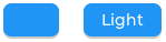
id: btn_idTo have a button with a text label on it, add a child label widget to it:
# Example toggle button with text:
- button:
    x: 10
    y: 10
    width: 70
    height: 30
    id: btn_id
    checkable: true
    widgets:
      - label:
          align: center
          text: "Light"

# Example trigger:
- button:
    ...
    on_value:
      then:
        - logger.log:
            format: "Button checked state: %d"
            args: [ x ]
The button can be also integrated as a Binary Sensor or as a Switch component.
See Remote light button for an example which demonstrates how to use a checkable button to act on a Home Assistant service.
buttonmatrix
The button matrix widget is a lightweight way to display multiple buttons in rows and columns. It’s lightweight because the buttons are not actually created but instead simply drawn on the fly. This reduces the memory footprint of each button from approximately 200 bytes (for both the button and its label widget) down to only eight bytes.
Configuration variables:
rows (Required, list): A list for the button rows:
- buttons (Required, list): A list of buttons in a row:
- id (Optional): An ID for the button in the matrix.
- key_code (Optional, string): One character be sent as the key code to a Key collector component instead of
textwhen the button is pressed. - selected (Optional, boolean): Set the button as the most recently released or focused. Defaults to
false. - text (Optional, Text property): Text to display on the button.
- width (Optional): Width relative to the other buttons in the same row. Must be a value between
1and15; the default is1(for example, given a line with two buttons, one withwidth: 1and another one withwidth: 2, the first will be33%wide while the second will be66%wide). - control (Optional): Binary flags to control behavior of the buttons (all
falseby default):- checkable (Optional, boolean): Enable toggling of a button,
checkedstate will be added/removed as the button is clicked. - checked (Optional, boolean): Make the button checked. Apply
checkedstyles to the button. - click_trig (Optional, boolean): Control how to trigger
on_value: iftrueon click, iffalseon press. - custom_1 and custom_2 (Optional, boolean): Custom, free to use flags.
- disabled (Optional, boolean): Apply
disabledstyles to the button. - hidden (Optional, boolean): Make a button hidden (hidden buttons still take up space in the layout, they are just not visible or clickable).
- no_repeat (Optional, boolean): Disable repeating when the button is long pressed.
- popover (Optional, boolean): Show the button label in a popover when pressing this button.
- recolor (Optional, boolean): Enable recoloring of button text with
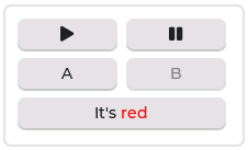
#. For example:It's #FF0000 red#
- checkable (Optional, boolean): Enable toggling of a button,
- buttons (Required, list): A list of buttons in a row:
items (Optional, list): Settings for the items part, the buttons all use the text and typical background style properties except translations and transformations.
one_checked (Optional, boolean): Allow only one button to be checked at a time (aka. radio buttons). Defaults to
false.Style options from Style properties for the background of the button matrix, uses the typical background style properties.
pad_rowandpad_columnset the space between the buttons.
Actions:
lvgl.buttonmatrix.updateaction updates the item styles and properties specified in the specificstate,itemsoptions.- id (Required): The ID or a list of IDs of buttonmatrix widgets to be updated.
- Widget styles or properties from
state,itemsoptions above, to be updated.
lvgl.matrix.button.updateaction updates the button styles and properties specified in the specificcontrol,widthandselectedoptions.- id (Required): The ID or a list of IDs of matrix buttons to be updated.
- Widget styles or properties from
control,widthandselectedoptions above, to be updated.
Triggers:
on_valueand interaction triggers can be configured for each button, is activated after clicking. Ifcheckableistrue, the boolean variablex, representing the checked state, may be used by lambdas within this trigger.- The interaction LVGL event triggers can be configured for the main widget, they pass the ID of the pressed button (or null if nothing pressed) as variable
x(a pointer to auint16_twhich holds the index number of the button).
Example:
# Example widget:
- buttonmatrix:
    x: 10
    y: 40
    width: 220
    items:
      pressed:
        bg_color: 0xFFFF00
    id: matrix_id
    rows:
      - buttons:
        - id: button_1
          text: "\uF04B"
          control:
            checkable: true
        - id: button_2
          text: "\uF04C"
          control:
            checkable: true
      - buttons:
        - id: button_3
          text: "A"
          control:
            popover: true
        - id: button_4
          text: "B"
          control:
            disabled: true
      - buttons:
        - id: button_5
          text: "It's #ff0000 red#"
          width: 2
          control:
            recolor: true

# Example action:
on_...:
  then:
    - lvgl.matrix.button.update:
        id: button_1
        width: 1
        selected: true
        control:
          checkable: false
    - lvgl.buttonmatrix.update:
        id: matrix_id
        state:
          disabled: true
        items:
          bg_color: 0xf0f0f0

# Example trigger:
- buttonmatrix:
    ...
    rows:
      - buttons:
        ...
        - id: button_2
          ...
          control:
            checkable: true
          on_value: # Trigger for the individual button, returning the checked state
            then:
              - logger.log:
                  format: "Button 2 checked: %d"
                  args: [ x ]
    on_press: # Triggers for the matrix, to determine which button was pressed.
      logger.log:
        format: "Matrix button pressed: %d"
        args: ["x"]  # If x is 65535, it was the container, (or through a disabled button).
    on_click:
      logger.log:
        format: "Matrix button clicked: %d, is button_2 = %u"
        args: ["x", "id(button_2) == x"]
✅ Tip
The Button Matrix widget supports the Key collector component to collect the button presses as key press sequences for further automations. Check out A numeric input keypad for an example.
canvas
The canvas widget provides a surface for custom drawing operations. It allows you to draw shapes, text, images and perform pixel-level manipulations.
All options are templatable.
Where a list of points is required, this can be provided in the form of a list of dictionaries, each with templatable x and y keys, or as a shorthand x,y pair (constant integers only.)
Configuration variables:
- width (Required, int): Width of the canvas in pixels.
- height (Required, int): Height of the canvas in pixels.
- transparent (Optional, boolean): Enable alpha channel support. Defaults to
false.
Actions:
lvgl.canvas.fillfills the entire canvas with a color:lvgl.canvas.set_pixelssets individual pixels:lvgl.canvas.draw_rectangledraws a rectangle:- id (Required): The ID of the canvas widget.
- x (Required, int): X coordinate.
- y (Required, int): Y coordinate.
- width (Required, int): Width in pixels
- height (Required, int): Height in pixels
- radius (Optional, int): Corner radius.
- bg_color (Optional, color): Background color.
- bg_opa (Optional, opacity): Background opacity. Defaults to
COVER. - border_color (Optional, color): Border color.
- border_width (Optional, int): Border width.
- border_opa (Optional, opacity): Border opacity. Defaults to
COVER. - outline_color (Optional, color): Outline color.
- outline_width (Optional, int): Outline width.
- outline_opa (Optional, opacity): Opacity of the outline. Defaults to
COVER. - outline_pad (Optional, int): Padding of the outline. Defaults to
0. - shadow_color (Optional, color): Shadow color.
- shadow_width (Optional, int): Shadow width.
- shadow_opa (Optional, opacity): Opacity of the shadow. Defaults to
COVER. - shadow_offset_x (Optional, int): Shadow offset X.
- shadow_offset_y (Optional, int): Shadow offset Y.
- shadow_spread (Optional, int): Shadow spread.
lvgl.canvas.draw_polygondraws a polygon:- id (Required): The ID of the canvas widget.
- points (Required, list): List of points forming the polygon vertices.
- Other options as for
lvgl.canvas.draw_rectangle.
lvgl.canvas.draw_textdraws text:- id (Required): The ID of the canvas widget.
- x (Required, int): X coordinate.
- y (Required, int): Y coordinate.
- text (Required, string): Text to draw.
- max_width (Required, int): Max width in pixels.
- align (Optional, enum): Alignment of the text relative to
xandmax_width. One ofLEFT,CENTER,RIGHT,AUTO. - color (Optional, color): Text color.
- opa (Optional, opacity): Text opacity. Defaults to
COVER. - font (Optional, string): Font to use.
- decor (Optional, list): Choose decorations for the text:
NONE,UNDERLINE,STRIKETHROUGH(multiple can be specified as YAML list). Defaults toNONE. - letter_space (Optional, int16): Extra character spacing of the text. Defaults to
0. - line_space (Optional, int16): Line spacing of the text. Defaults to
0.
lvgl.canvas.draw_linedraws a line:- id (Required): The ID of the canvas widget.
- points (Required, list): List of points forming the line, each with:
- x (Required, int): X coordinate.
- y (Required, int): Y coordinate.
- color (Optional, color): Line color.
- width (Optional, int): Line width.
- opa (Optional, opacity): Line opacity. Defaults to
COVER. - round_start (Optional, boolean): Round the start of the line. Defaults to
false. - round_end (Optional, boolean): Round the end of the line. Defaults to
false.
lvgl.canvas.draw_arcdraws an arc:- id (Required): The ID of the canvas widget.
- x (Required, int): Center X coordinate.
- y (Required, int): Center Y coordinate.
- radius (Required, int): Arc radius.
- start_angle (Required, 0-360): Start angle.
- end_angle (Required, 0-360): End angle.
- color (Optional, color): Arc color.
- width (Optional, int): Arc line width.
- opa (Optional, opacity): Arc opacity. Defaults to
COVER. - rounded (Optional, boolean): Round the start/end of the arc.
lvgl.canvas.draw_imagedraws an image:- id (Required): The ID of the canvas widget.
- x (Required, int): X coordinate.
- y (Required, int): Y coordinate.
- src (Required, string): Image source.
- angle (Optional, 0-360): Rotation angle.
- zoom (Optional, float): Zoom factor 0.1-10.0 (default 1.0)
- pivot_x (Optional, int): X pivot point for rotation.
- pivot_y (Optional, int): Y pivot point for rotation.
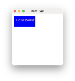
# Example widget:
- canvas:
    id: my_canvas
    width: 240
    height: 240
    transparent: false

# Example drawing actions, executed at startup:
    on_boot:
      then:
        # Fill canvas with white
        - lvgl.canvas.fill:
            id: my_canvas
            color: white
        # Draw a blue rectangle
        - lvgl.canvas.draw_rectangle:
            id: my_canvas
            x: 10
            y: 10
            width: 100
            height: 50
            bg_color: blue
        # Draw some red text
        - lvgl.canvas.draw_text:
            id: my_canvas
            x: 20
            y: 20
            text: "Hello World"
            max_width: 100
            color: red
checkbox
The checkbox widget is made internally from a tick box and a label. When the checkbox is clicked the tick box’s checked state will be toggled.
Configuration variables:
- indicator (Optional, list): Settings for the indicator part to show the value. Supports a list of styles and state-based styles to customize. The “tick box” is a square that uses all the typical background style properties. By default, its size is equal to the height of the main part’s font. Padding properties make the tick box larger in the respective directions.
- Style options from Style properties for the background of the widget and it uses the text and all the typical background style properties.
pad_columnadjusts the spacing between the tick box and the label.
Actions:
lvgl.checkbox.updateaction updates the widget styles and properties from the specific options above, just like the lvgl.widget.update action is used for the common styles, states or flags.- id (Required): The ID or a list of IDs of checkbox widgets to be updated.
- text (Optional, Text property): Text to display beside the checkbox.
- Style options from Style properties for the background of the widget and it uses the text and all the typical background style properties.
pad_columnadjusts the spacing between the tick box and the label.
Triggers:
on_changetrigger is activated when interactively toggling the checkbox. The boolean variablex, representing the checkbox’s state, may be used by lambdas within this trigger.on_valuetrigger is activated when the checkbox is toggled, either by user interaction or programmatically. The new value is returned in the variablex.- interaction LVGL event triggers which also return the value in
x.
Example:
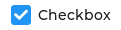
# Example widget:
- checkbox:
    x: 10
    y: 10
    id: checkbox_id
    text: Checkbox

# Example action:
on_...:
  then:
    - lvgl.checkbox.update:
        id: checkbox_id
        state:
          checked: true
        text: Checked

# Example trigger:
- checkbox:
    ...
    on_value:
      then:
        - logger.log:
            format: "Checkbox state: %d"
            args: [ x ]
ℹ️ Note
In case you configure
default_fontin the main section to a custom font, the checkmark will not be shown correctly when the checkbox is in the checked state. See Restore checkbox mark for how to easily resolve this.
The checkbox can be also integrated as a Switch component.
container
A container is an unstyled widget that is, as the name suggests, intended to act as a container for other widgets.
It is functionally identical to an obj but has no styles applied to it, so without any styling or widgets
it is invisible. It has a default width and height of 100%.
Configuration variables:
- Style options from Style properties.
Triggers:
- interaction LVGL event triggers.
Example:
# Example widget:
- container:
    x: 10
    y: 10
    width: 220
    height: 300
    widgets:
      - ...
dropdown
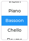
The dropdown widget allows the user to select one value from a list.
The dropdown list is closed by default and displays a single value. When activated (by clicking on the drop-down list), a list is drawn from which the user may select one option. When the user selects a new value, the list is deleted from the screen.
The Dropdown widget is built internally from a button part and a list part (both not related to the actual widgets with the same name).
Configuration variables:
- dir (Optional, str): Where the list part of the dropdown gets created relative to the button part.
LEFT,RIGHT,BOTTOM,TOP, defaults toBOTTOM. - dropdown_list (Optional, dict): Settings for the the list with items. Supports a list of styles to customize. Notable are
text_line_spaceandpad_allfor spacing of list items, andtext_fontto separately change the font in the list. The partsmain,scrollbarandselectedmay be customised. Note that changing styles on the selected item should be done in theselectedpart withcheckedstate.max_heightcan be used to limit the height of the list. - indicator (Optional, dict): Styles for the dropdown symbol.
- options (Required, list): The list of available options in the drop-down.
- selected_index (Optional, int8): The index of the item you wish to be selected.
- selected_text (Optional, string): The text of the item you wish to be selected.
- symbol (Optional, dict): A symbol (typically an chevron) is shown in dropdown list. If
dirof the drop-down list isLEFTthe symbol will be shown on the left, otherwise on the right. Choose a different symbol from those built-in or from your own customized font. - Style options from Style properties for the background of the button. Uses the typical background properties and
labeltext properties for the text on it.text_fontcan be used to set the font of the button part, including the symbol.
Actions:
lvgl.dropdown.updateaction updates the widget styles and properties from the specific options above, just like the lvgl.widget.update action is used for the common styles, states or flags.- id (Required): The ID or a list of IDs of dropdown widgets to update.
- dir (Optional, str): Where the list part of the dropdown gets created relative to the button part.
LEFT,RIGHT,BOTTOM,TOP. - options (Optional, list): The list of available options in the drop-down.
- All other configuration variables from above are optional and have the same function as previously described.
Triggers:
on_changetrigger is activated only when the user selects an item from the list. The new selected index is returned in the variablex. The interaction LVGL event triggers also apply, and they also return the selected index inx.on_valuetrigger is activated the selection changes, either by user interaction or programmatically. The new value is returned in the variablex.on_canceltrigger is also activated when you close the dropdown without selecting an item from the list. The currently selected index is returned in the variablex.- interaction LVGL event triggers which also return the value in
x.
Example:
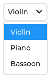
# Example widget:
- dropdown:
    id: dropdown_id
    width: 90
    align: CENTER
    options:
      - Violin
      - Piano
      - Bassoon
      - Chello
      - Drums
    selected_index: 2
    dropdown_list:
      selected:
        checked:
          text_color: 0xFF0000

# Example action:
on_...:
  then:
    - lvgl.dropdown.update:
        id: dropdown_id
        selected_index: 4

# Example trigger:
- dropdown:
    ...
    on_value:
      - logger.log:
          format: "Selected index is: %d"
          args: [ x ]
    on_cancel:
      - logger.log:
          format: "Dropdown closed. Selected index is: %d"
          args: [ x ]
The dropdown can be also integrated as Select component.
image
Images are the basic widgets used to display images.

Configuration variables:
src (Required, image): The ID of an existing image configuration.
angle (Optional, 0-360): Rotation of the image. Defaults to
0.0.antialias (Optional): The quality of the angle or scale transformation. When anti-aliasing is enabled, the transformations are higher quality but slower. Defaults to
false.mode (Optional): Either
REALorVIRTUAL. WithVIRTUAL, when the image is scaled or rotated, the real coordinates of the image object are not changed. The larger content simply overflows the object’s boundaries. It also means the layouts are not affected the by the transformations. WithREAL, if the width/height of the object is set toSIZE_CONTENT, the object’s size will be set to the scaled and rotated size. If an explicit size is set, the overflowing content will be cropped. Defaults toVIRTUAL.offset_x (Optional): Add a horrizontal offset to the image position.
offset_y (Optional): Add a vertical offset to the image position.
pivot_x (Optional): Horizontal position of the pivot point of rotation, in pixels, relative to the top left corner of the image. Defaults to the center of the image. Must be specified along with
pivot_y.pivot_y (Optional): Vertical position of the pivot point of rotation, in pixels, relative to the top left corner of the image. Defaults to the center of the image. Must be specified along with
pivot_xzoom (Optional, 0.1-10): Zoom of the image.
image_recolor (Optional, color): Color to mix with every pixel of an image Note that
image_recolor_opadefaults to TRANSP, so it must also be set.image_recolor_opa (Optional, opacity): Opacity of the image recoloring.
Some style options from Style properties for the background rectangle that uses the typical background style properties and the image itself using the image style properties.
Actions:
lvgl.image.updateaction updates the widget styles and properties from the specific options above, just like the lvgl.widget.update action is used for the common styles, states or flags.- id (Required): The ID or a list of IDs of image widgets to be updated.
- All other configuration variables from above are optional and have the same function as previously described. Updating the
srcoption changes the image at runtime.
Triggers:
- interaction LVGL event triggers.
Example:
# Example widget:
- image:
    align: CENTER
    src: cat_image
    id: img_id
    radius: 11
    clip_corner: true

# Example action:
on_...:
  then:
    - lvgl.image.update:
        id: img_id
        src: cat_image_bowtie
ℹ️ Note
Currently
RGB565type images are supported, with transparency using the optional parametertransparencyset. See Images for how to load an image for rendering in ESPHome. [!TIP]offset_xandoffset_ycan be useful when the widget size is set to be smaller than the image source size. A “running image” effect can be created by animating these values.
keyboard
The keyboard widget is a special Button matrix with predefined keymaps and other features to show an on-screen keyboard usable to type text into a textarea.
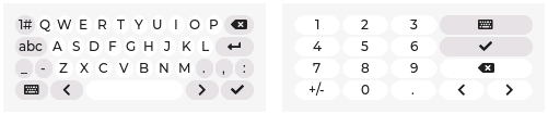
For styling, the keyboard widget uses the same settings as buttonmatrix.
Configuration variables:
- textarea (Optional): The ID of a
textareato associate with the keyboard. If provided, all key entries are recorded in thetextarea. - mode (Optional, enum): Keyboard layout to use. Each
TEXT_layout contains a button to allow the user to iterate through theTEXT_layouts.TEXT_LOWER: Display lower case letters (default).TEXT_UPPER: Display upper case letters.TEXT_SPECIAL: Display special characters.NUMBER: Display numbers, +/- sign, and decimal dot.
Actions:
lvgl.keyboard.updateaction updates the properties from the specific options above, plus any from lvgl.widget.update.- id (Required): The ID or a list of IDs of keyboard widgets which you want to update.
- mode (Optional, enum): Keyboard layout to use.
- All other configuration variables from above are optional and have the same function as previously described.
Triggers:
on_readytrigger is activated when the checkmark key is pressed.on_canceltrigger is activated when the key containing the keyboard icon is pressed.
Example:
# Example widget:
- keyboard:
    id: keyboard_id
    textarea: textarea_1
    mode: TEXT_UPPER

# Example actions:
on_focus:
  then:
    - lvgl.keyboard.update:
        id: keyboard_id
        mode: number
        textarea: textarea_2

# Example trigger:
- keyboard:
    ...
    on_ready:
      then:
        - logger.log: Keyboard is ready
    on_cancel:
      then:
        - logger.log: Keyboard cancelled
✅ Tip
The Keyboard widget supports the Key collector component to collect the button presses as key press sequences for further automations.
ℹ️ Note
The Keyboard widget in ESPHome doesn’t support popovers or custom layouts.
label
A label is the basic widget type that is used to display text.
Configuration variables:
- long_mode (Optional, list): By default, the width and height of the label is set to
SIZE_CONTENT. Therefore, the size of the label is automatically expanded to the text size. Otherwise, if thewidthorheightare explicitly set (or set by Layouts), the lines wider than the label’s width can be manipulated according to the long mode policies below. These policies can be applied if the height of the text is greater than the height of the label.WRAP: Wrap lines which are too long. If the height isSIZE_CONTENT, the label’s height will be expanded, otherwise the text will be clipped (default).DOT: Replaces the last 3 characters from bottom right corner of the label with dots.SCROLL: If the text is wider than the label, scroll the text horizontally back and forth. If it’s higher, scroll vertically. Text will scroll in only one direction; horizontal scrolling has higher precedence.SCROLL_CIRCULAR: If the text is wider than the label, continuously scroll the text horizontally. If it’s higher, scroll vertically. Text will scroll in only one direction; horizontal scrolling has higher precedence.CLIP: Simply clip the parts of the text outside the label.
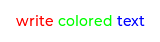
- recolor (Optional, boolean): Enable recoloring of button text with
#. This makes it possible to set the color of characters in the text individually by prefixing the text to be re-colored with a#RRGGBBhexadecimal color code followed by a space, and finally closed with a single hash#tag. For example:Write a #FF0000 red# word. - scrollbar (Optional, list): Settings for the indicator part to show the value. Supports a list of styles and state-based styles to customize. The scroll bar that is shown when the text is larger than the widget’s size.
- selected (Optional, list): Settings for the the style of the selected text. Only
text_colorandbg_colorstyle properties can be used. - text_align (Optional, enum): Alignment of the text in the widget - it doesn’t align the object itself, only the lines inside the object. One of
LEFT,CENTER,RIGHT,AUTO. Inherited from parent. Defaults toAUTO, which detects the text base direction and uses left or right alignment accordingly. - text_color (Optional, color): Color to render the text in. Inherited from parent. Defaults to
0(black). - text_decor (Optional, list): Choose decorations for the text:
NONE,UNDERLINE,STRIKETHROUGH(multiple can be specified as YAML list). Inherited from parent. Defaults toNONE. - text_font: (Optional, font): The ID of the font used to render the text or symbol. Inherited from parent.
- text_letter_space (Optional, int16): Extra character spacing of the text. Inherited from parent. Defaults to
0. - text_line_space (Optional, int16): Line spacing of the text. Inherited from parent. Defaults to
0. - text_opa (Optional, opacity): Opacity of the text. Inherited from parent. Defaults to
COVER. - text (Optional, Text property): Text to display on the label.
- Style options from Style properties. Uses all the typical background properties and the text properties. The padding values can be used to add space between the text and the background.
ℹ️ Note
Newline escape sequences are handled automatically by the label widget. You can use
\nto make a line break. For example:"line1\nline2\n\nline4". For escape sequences like newline to be translated, enclose the string in double quotes.
Actions:
lvgl.label.updateaction updates the widget styles and properties from the specific options above, just like the lvgl.widget.update action is used for the common styles, states or flags.- id (Required): The ID or a list of IDs of label widgets to be updated.
- text (Optional, Text property): New text to display on the label.
- All other configuration variables from above are optional and have the same function as previously described.
Triggers:
- interaction LVGL event triggers.
Example:
# Example widget:
- label:
    align: CENTER
    id: lbl_id
    recolor: true
    text: "#FF0000 write# #00FF00 colored# #0000FF text#"

- label:
    align: TOP_MID
    id: lbl_symbol
    text_font: montserrat_28
    text: "\uF013"

# Example action (update label with a value from a sensor):
on_...:
  then:
    - lvgl.label.update:
        id: lbl_id
        text:
          format: "%.0fdBm"
          args: [ 'id(wifi_signal_db).get_state()' ]
The label can be also integrated as Text or Text Sensor component.
led
The LED widgets are either circular or rectangular widgets whose brightness can be adjusted. As their brightness decreases, the colors become darker.

Configuration variables:
- brightness (Optional, percentage): The brightness of the LED color, where
0%corresponds to black, and100%corresponds to the full brightness of the color specified above. - color (Optional, color): Color for the background, border, and shadow of the widget.
- Style options from Style properties, using all the typical background style properties.
Actions:
lvgl.led.updateaction updates the widget styles and properties from the specific options above, just like the lvgl.widget.update action is used for the common styles, states or flags.- id (Required): The ID or a list of IDs of led widgets to be updated.
- All other configuration variables from above are optional and have the same function as previously described.
Triggers:
- interaction LVGL event triggers.
Example:
# Example widget:
- led:
    id: led_id
    align: CENTER
    color: 0xFF0000
    brightness: 70%

# Example action:
on_...:
  then:
    - lvgl.led.update:
        id: led_id
        color: 0x00FF00
The led can be also integrated as Light component.
ℹ️ Note
If configured as a light component,
colorandbrightnessare overridden by the light at startup, according to itsrestore_modesetting.
Check out A numeric input keypad in the Cookbook for an example which demonstrates how to change the led styling properties from an automation.
line
The line widget is capable of drawing straight lines between a set of points.

Configuration variables:
- line_color (Optional, color): Color for the line.
- line_dash_gap (Optional, int16): Set the width of the gap between the dashes in the line (in pixels).
- line_dash_width (Optional, int16): Set the width of the dashes in the line (in pixels).
- line_rounded (Optional, boolean): Make the end points of the line rounded.
truerounded,falseperpendicular line ending. - line_width (Optional, int16): Set the width of the line in pixels.
- points (Required, list): A list of
x, yinteger pairs for point coordinates (origin from top left of parent) - Style options from Style properties, all the typical background properties and line style properties.
By default, the Line widget width and height dimensions are set to SIZE_CONTENT. This means it will automatically set its size to fit all the points. If the size is set explicitly, parts of the line may not be visible.
The points list may be defined with constants in the form x, y or as a list of dictionaries with x and y keys. The latter allows for more complex point definitions, such as using a lambda function to calculate the coordinates.
Actions:
lvgl.line.updateaction updates the points and any style properties.- id (Required): The ID or a list of IDs of lines to update.
- points (Required): A point list as described above.
Example:
# Example widget:
- line:
    points:
      - 5, 5
      - 70, 70
      - 120, 10
      - x: !lambda return random_uint32() % 100;
        y: !lambda return random_uint32() % 100;
      - 230, 15
    line_width: 8
    line_color: 0x0000FF
    line_rounded: true
meter
The meter widget can visualize data in very flexible ways. It can use arcs, needles, ticks, lines and/or labels.

Configuration variables:
- scales (Required, list): A list with (any number of) scales to be added to the meter.
- angle_range (Required): The angle between start and end of the tick scale. Defaults to
270. - indicators (Required, list): A list with indicators to be added to the scale. Multiple of each can be added. Their values are interpreted in the range of the scale:
- arc (Optional): Add a background arc the scale:
- color: Color to draw the arc. Defaults to
0(black). - end_value: The value in the scale range to end drawing the arc to.
- r_mod: Adjust the position of the arc from the scale radius with this amount (can be negative). Defaults to
0. - start_value: The value in the scale range to start drawing the arc from.
- width: Arc width in pixels. Defaults to
4. - opa: Opacity of the arc. Defaults to 100%.
- color: Color to draw the arc. Defaults to
- image (Optional): Add a rotating needle image to the scale:
- id: Manually specify the ID used for updating the indicator value at runtime.
- pivot_x: Horizontal position of the pivot point of rotation, in pixels, relative to the top left corner of the image.
- pivot_y: Vertical position of the pivot point of rotation, in pixels, relative to the top left corner of the image.
- src: The ID of an existing image configuration, representing a needle pointing to the right like
-o--->. - value: The value in the scale range to show at start.
- opa: Opacity of the image. Defaults to 100%.
- line (Optional): Add a needle line to the scale. By default, the length of the line is the same as the scale’s radius:
- color: Color for the needle line. Defaults to
0(black). - id: Manually specify the ID used for updating the indicator value at runtime.
- r_mod: Adjust the length of the needle from the scale radius with this amount (can be negative). Defaults to
0. - value: The value in the scale range to show at start.
- width: Needle line width in pixels. Defaults to
4. - opa: Opacity of the needle. Defaults to 100%.
- color: Color for the needle line. Defaults to
- tick_style (Optional): Add tick style modifications:
- color_end: Color for the gradient end of the ticks.
- color_start: Color for the gradient start of the ticks.
- end_value: The value in the scale range to modify the ticks to.
- local: If
truethe ticks’ color will be faded fromcolor_starttocolor_endin the start and end values specified above. Iffalse,color_startandcolor_endwill be mapped to the entire scale range (and only a slice of that color gradient will be visible in the indicator’s start and end value range). Defaults tofalse. - start_value: The value in the scale range to modify the ticks from.
- width: Modifies the
widthof the tick lines.
- arc (Optional): Add a background arc the scale:
- range_from (Required): The minimum value of the tick scale. Defaults to
0. - range_to (Required): The maximum value of the tick scale. Defaults to
100. - rotation (Optional): The rotation angle offset of the tick scale.
- ticks (Required, list): A scale can have minor and major ticks and labels on the major ticks. To add the minor ticks:
- color (Optional, color): Color to draw the ticks. Required if
countis greater than0. Defaults to0x808080. - count (Required): How many ticks to be on the scale. Defaults to
12. - length (Optional): Tick line length in pixels. Required if
countis greater than0. Defaults to10. - width (Optional): Tick line width in pixels. Required if
countis greater than0. Defaults to2. - major (Optional, list): If you want major ticks and value labels displayed:
- color: Color to draw the major ticks. Defaults to
0(black). - label_gap: Label distance from the ticks with text proportional to the values of the tick line. Defaults to
4. - length: Tick line length in pixels or percentage. Defaults to
15%. - stride: How many minor ticks to skip when adding major ticks. Defaults to
3. - width: Tick line width in pixels. Defaults to
5.
- color: Color to draw the major ticks. Defaults to
- Style options from Style properties for the tick lines and labels using the
lineandlabeltext style properties.
- color (Optional, color): Color to draw the ticks. Required if
- angle_range (Required): The angle between start and end of the tick scale. Defaults to
- Style options from Style properties for the background of the meter, using the typical background properties.
- ticks (Optional, dict): Styling options for the ticks part, which will be applied to the tick lines and labels using standard line and label styles.
- indicator (Optional, dict): Styling options for the indicator part, which will be applied to the needle line or image using standard line and image styles. Background properties applied here will style the pivot (the dot in the middle of the meter) for example to hide the pivot use
bg_opa: transpin theindicatorstyle. - items (Optional, dict): Settings for the items part, which will be applied to arcs.
ℹ️ Note
The zero degree position is at the middle right (3 o’clock) of the widget and the degrees increase in a clockwise direction from there. Angles are specified in the
0-360range.
Actions:
lvgl.indicator.updateaction updates indicator options as below. lvgl.widget.update action can be used for the common styles, states or flags of the meter widget.- id (Required): The ID or a list of IDs of indicators to update.
- end_value (Optional): The value in the scale range to end drawing the arc to.
- start_value (Optional): The value in the scale range to start drawing the arc from.
- opa (Optional): Opacity of the indicator.
Triggers:
- interaction LVGL event triggers.
Example:
# Example widget:
- meter:
    align: center
    scales:
      range_from: -10
      range_to: 40
      angle_range: 240
      rotation: 150
      ticks:
        count: 51
        length: 3
        major:
          stride: 5
          length: 13
          label_gap: 13
      indicators:
        - line:
            id: temperature_needle
            width: 2
            color: 0xFF0000
            r_mod: -4
        - tick_style:
            start_value: -10
            end_value: 40
            color_start: 0x0000bd #FF0000
            color_end: 0xbd0000 #0000FF

# Example action:
on_...:
  then:
    - lvgl.indicator.update:
        id: temperature_needle
        value: 3
See Semicircle gauge, Thermometer and An analog clock in the Cookbook for examples which demonstrate how to effectively use this widget.
msgboxes
The message boxes act as pop-ups. They are built from a background container, a title, an optional close button, a text and optional buttons.
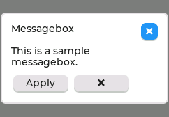
The text will be broken into multiple lines automatically and the height will be set automatically to include the text and the buttons. The message box is modal (blocks clicks on the rest of the screen until closed).
Configuration variables:
- msgboxes (Optional, list): A list of message boxes to use. This option is available only at the top level of the LVGL component configuration. Each list entry may have the following options:
- title (Required, string): A string to display at the top of the message box.
- body (Optional, dict): The content of the body of the message box:
- text (Optional, Text property): The text to display in the body of the message box.
- Style options from Style properties. Uses all the typical background properties and the text properties.
- buttons (Optional, list): A list of buttons to show at the bottom of the message box:
- text (Optional, Text property): Text to display on the button.
- See
buttonmatrixfor other options for the buttons.
- button_style (Optional, dict): A style to apply to the buttons. Uses all the typical style properties. Buttons cannot be individually styled since they are part of a
buttonmatrix. - close_button (Optional, boolean): Controls the presence of the close button to the top right of the message box. Defaults to true
Actions:
The configured message boxes are hidden by default. They can be shown and hidden using lvgl.widget.show and lvgl.widget.hide respectively actions.
Example:
# Example widget:
lvgl:
  ...
  msgboxes:
    - id: message_box
      close_button: true
      title: Message box
      body:
        text: "This is a sample message box."
        bg_color: 0x808080
      buttons:
        - id: msgbox_apply
          text: "Apply"
        - id: msgbox_close
          text: "\uF00D"
          on_click:
            then:
              - lvgl.widget.hide: message_box
✅ Tip
You can create your own more complex dialogs with a full-screen sized, half-opaque
objwith any child widgets on it, and thehiddenflag set totrueby default. For non-modal dialogs, simply set theclickableflag tofalseon it.
obj
The base object is just a simple, empty widget. By default, it’s nothing more than a rounded rectangle:
You can use it as a parent container for other widgets. By default, it catches touches. Since obj has default
styling applied, you may choose to use container instead if the role is simply to group other
widgets.
Configuration variables:
- Style options from Style properties.
Triggers:
- interaction LVGL event triggers.
Example:
# Example widget:
- obj:
    x: 10
    y: 10
    width: 220
    height: 300
    widgets:
      - ...
qrcode
Use this widget to generate and display a QR-code containing a string at run time.
Configuration variables:
- text (Optional, Text property): Text to be encoded in the QR.
- size (Required, int16): Set the desired size of the QR-code (in pixels). QR-codes with less data are smaller, but they scaled by an integer number to best fit to the given size.
- light_color (Optional, color): Color for the light areas of the QR. Defaults to white.
- dark_color (Optional, color): Color for the dark areas of the QR. Defaults to black.
- Style options from Style properties.
Actions:
lvgl.qrcode.updateaction updates the widget’stextproperty to display a new QR-code.- id (Required): The ID of the qrcode widget to be updated.
- text (Optional, Text property): New text to be encoded in the QR.
- Style options from Style properties.
Triggers:
- interaction LVGL event triggers.
Example:
# Example widget:
- qrcode:
    id: lv_qr
    size: 100
    light_color: whitesmoke
    dark_color: steelblue
    text: esphome.io

# Example action:
on_...:
  then:
    - lvgl.qrcode.update:
        id: lv_qr
        text: home-assistant.io
roller
Roller allows you to simply select one option from a list by scrolling.
Configuration variables:
- anim_time (Optional, Time): When the Roller is scrolled and doesn’t stop exactly on an option it will scroll to the nearest valid option automatically in this amount of time.
- mode (Optional, enum): Option to make the roller circular.
NORMALorINFINITE, defaults toNORMAL. - options (Required, list): The list of available options in the roller.
- selected_index (Optional, int8): The index of the item you wish to be selected.
- selected_text (Optional, string): The text of the item you wish to be selected.
- selected (Optional, list): Settings for the selected part to show the value. Supports a list of styles and state-based styles to customize. The selected option in the middle. Besides the typical background properties it uses the
labeltext style properties to change the appearance of the text in the selected area. - visible_row_count (Optional, int8): The number of visible rows.
- Style options from Style properties. The background of the roller uses all the typical background properties and
labelstyle properties.text_line_spaceadjusts the space between the options.
Actions:
lvgl.roller.updateaction updates the widget styles and properties from the specific options above, just like the lvgl.widget.update action is used for the common styles, states or flags.- id (Required): The ID or a list of IDs of roller widgets to be updated.
- animated (Optional, boolean): Animate the indicator to the new selected value. Defaults to
true. - All the other roller options as listed above.
Triggers:
on_changetrigger is activated only when the user selects an item from the list. The new selected index is returned in the variablex. The interaction LVGL event triggers also apply, and they also return the selected index inx.on_valuetrigger is activated the selection changes, either by user interaction or programmatically. The new value is returned in the variablex.- interaction LVGL event triggers which also return the selected index in
x.
Example:
# Example widget:
- roller:
    align: CENTER
    id: roller_id
    options:
      - Violin
      - Piano
      - Bassoon
      - Chello
      - Drums

# Example action:
on_...:
  then:
    - lvgl.roller.update:
        id: roller_id
        selected_index: 4

# Example trigger:
- roller:
    ...
    on_value:
      - logger.log:
          format: "Selected index is: %d, text is: %s"
          args: [x, text.c_str()]
The roller can be also integrated as Select component.
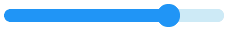
slider
The slider widget looks like a bar supplemented with a knob. The user can drag the knob to set a value. Just like bar, slider can be vertical or horizontal. The size of the indicator foreground and the knob position is set according to the current value of the slider.
Configuration variables:
- anim_time (Optional, Time): Sets the animation time if the value is set with
animated: true. - animated (Optional, boolean): Animate the indicator on boot to the starting value. Defaults to
true. - indicator (Optional, list): Settings for the indicator part to show the value. Supports a list of styles and state-based styles to customize. The indicator shows the current state of the slider. Also uses all the typical background style properties.
- knob (Optional, list): Settings for the knob part to control the value. Supports a list of styles and state-based styles to customize. A rectangle (or circle) is drawn at the current value. Also uses all the typical background properties to describe the knob. By default, the knob is square (with an optional corner radius) with side length equal to the smaller side of the slider. The knob can be made larger with the padding values. Padding values can be asymmetric.
- max_value (Optional, int8): Maximum value of the indicator. Defaults to
100. - min_value (Optional, int8): Minimum value of the indicator. Defaults to
0. - value (Optional, int8): Actual value of the indicator at start, in
min_value-max_valuerange. Defaults to0. - Any Styling and state-based option for the background of the slider. Uses all the typical background style properties. Padding makes the indicator smaller in the respective direction.
Normally, the slider can be adjusted either by dragging the knob, or by clicking on the slider bar. In the latter case the knob moves to the point clicked and slider value changes accordingly. In some cases it is desirable to set the slider to react on dragging the knob only. This feature is enabled by enabling the adv_hittest flag.
Actions:
lvgl.slider.updateaction updates the widget styles and properties from the specific options above, just like the lvgl.widget.update action is used for the common styles, states or flags.- id (Required): The ID or a list of IDs of slider widgets to be updated.
- animated (Optional, boolean): Animate the indicator to the new value. Defaults to
true. - value (Optional, int8): New value of the indicator.
- Any Styling and state-based option for the background of the slider. Uses all the typical background style properties. Padding makes the indicator smaller in the respective direction.
Triggers:
on_valuetrigger is activated when the slider value changes, either by user interaction or programmatically. The new value is returned in the variablex.on_changetrigger is activated when the slider value is changed by user interaction. The new value is returned in the variablex.- interaction LVGL event triggers which also return the value in
x.
Example:
# Example widget:
- slider:
    x: 10
    y: 10
    width: 220
    id: slider_id
    value: 75
    min_value: 0
    max_value: 100

# Example action:
on_...:
  then:
    - lvgl.slider.update:
        id: slider_id
        knob:
          bg_color: 0x00FF00
        value: 55

# Example trigger:
- slider:
    ...
    on_value:
      - logger.log:
          format: "Slider value is: %.0f"
          args: [ 'x' ]
ℹ️ Note
The
on_valuetrigger is sent as the slider is dragged or changed with keys. The event is sent continuously while the slider is being dragged; this generally has a negative effect on performance. To mitigate this, consider using a universal interaction trigger likeon_release, to get thexvariable once after the interaction has completed.
The slider can be also integrated as Number or Sensor component.
See Light brightness slider and Media player volume slider for examples which demonstrate how to use a slider to control entities in Home Assistant.
spinbox
The spinbox contains a numeric value (as text) which can be increased or decreased through actions. You can, for example, use buttons labeled with plus and minus to call actions which increase or decrease the value as required.

Configuration variables:
- anim_time (Optional, Time): Sets the cursor’s blink time.
- decimal_places (Optional, 0..6): The number of digits after the decimal point. If
0, no decimal point is displayed. Defaults to0. - digits (Optional, 1..10): The number of digits (excluding the decimal separator and the sign characters). Defaults to
4. - range_from (Optional, float): The minimum value allowed to set the spinbox to. Defaults to
0. - range_to (Optional, float): The maximum value allowed to set the spinbox to. Defaults to
100. - rollover (Optional, boolean): While increasing or decreasing the value, if either the minimum or maximum value is reached with this option enabled, the value will change to the other limit. If disabled, the value will remain at the minimum or maximum value. Defaults to
false. - selected_digit (Optional, int): The ordinal number of the digit to be initially focused. Defaults to
0which represents the least significant digit. This digit will be incremented or decremented by one whenincrementordecrementactions are called. - value (Optional, float): Actual value to be shown by the spinbox at start. Defaults to
0.
ℹ️ Note
The sign character will only be shown if the set range contains negatives.
Actions:
lvgl.spinbox.updateaction updates the widget styles and properties from the specific options above, just like the lvgl.widget.update action is used for the common styles, states or flags.- id (Required): The ID or a list of IDs of spinbox widgets to be updated.
- value (Required, float): New value of the spinbox.
lvgl.spinbox.incrementaction increases the value by onestepconfigured above.- id (Required): The ID of the spinbox widget which you want to increment.
lvgl.spinbox.decrementaction decreases the value by onestepconfigured above.- id (Required): The ID of the spinbox widget which you want to decrement.
Triggers:
on_valuetrigger is activated when the spinbox value changes, either by user interaction or programmatically. The new value is returned in the variablex.- interaction LVGL event triggers which also return the value in
x.
Example:
# Example widget:
- spinbox:
    id: spinbox_id
    text_align: center
    range_from: -10
    range_to: 40
    selected_digit: 2
    digits: 3
    decimal_places: 1

# Example actions:
on_...:
  then:
    - lvgl.spinbox.decrement: spinbox_id
on_...:
  then:
    - lvgl.spinbox.update:
        id: spinbox_id
        value: 25.5

# Example trigger:
- spinbox:
    ...
    on_value:
      then:
        - logger.log:
            format: "Spinbox value is %f"
            args: [ x ]
The spinbox can be also integrated as a Number or Sensor component.
See Climate control for an example which demonstrates how to implement a thermostat control using the spinbox.
spinner
The Spinner widget is a spinning arc over a ring.
Configuration variables:
- arc_color (Optional, color): Color to draw the arcs.
- arc_length (Required, 0-360): Length of the spinning arc in degrees.
- arc_opa (Optional, opacity): Opacity of the arc.
- arc_rounded (Optional, boolean): Make the end points of the arcs rounded.
truerounded,falseperpendicular line ending. - arc_width (Optional, int16): Set the width of the arcs in pixels.
- indicator (Optional, list): Settings for the indicator part to show the value. Supports a list of styles and state-based styles to customize. Draws another arc using the arc style properties. Its padding values are interpreted relative to the background arc.
- spin_time (Required, Time): Duration of one cycle of the spin.
- Style options from Style properties.
Actions:
lvgl.spinner.updateaction, just like the lvgl.widget.update action is used for the common styles, states or flags.- id (Required): The ID or a list of IDs of spinner widgets to be updated.
- Style options from Style properties.
Triggers:
- interaction LVGL event triggers.
Example:
# Example widget:
- spinner:
    align: center
    spin_time: 2s
    arc_length: 60deg
    id: spinner_id
    indicator:
      arc_color: 0xd4d4d4

# Example action:
on_...:
  then:
    - lvgl.spinner.update:
        id: spinner_id
        arc_color: 0x31de70
switch
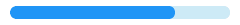
The switch looks like a little slider and can be used to turn something on and off.

Configuration variables:
- indicator (Optional, list): Settings for the indicator part, the foreground area underneath the knob shown when the switch is in
checkedstate. Supports a list of styles and state-based styles to customize. - knob (Optional, list): Settings for the knob part to control the value. Supports a list of styles and state-based styles to customize.
- Style options from Style properties.
Triggers:
on_valuetrigger is activated when the switch value changes, either by user interaction or programmatically. The new value is returned in the variablex.on_changetrigger is activated when the switch value is changed by user interaction. The new value is returned in the variablex.- interaction LVGL event triggers which also return the value in
x.
Example:
# Example widget:
- switch:
    x: 10
    y: 10
    id: switch_id

# Example trigger:
- switch:
    ...
    on_value:
      then:
        - logger.log:
            format: "Switch state: %d"
            args: [ x ]
The switch can be also integrated as a Switch component.
See Local light switch for an example which demonstrates how to use a switch to act on a local component.
tabview
The tab view object can be used to organize content in tabs. The tab buttons are internally generated with a buttonmatrix.
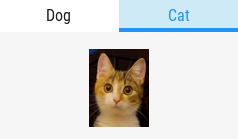
The tabs are indexed (zero-based) in the order they appear in the configuration file. A new tab can be selected either by clicking on a tab button, by sliding horizontally on the content or via the lvgl.tabview.select action, specifying the tab’s index.
Configuration variables:
- position (Optional, enum): Position of the tab selector buttons. One of
TOP,BOTTOM,LEFT,RIGHT. Defaults toTOP. - size (Optional, percentage): The height (in case of
TOP,BOTTOM) or width (in case ofLEFT,RIGHT) tab buttons. Defaults to10%. - tabs (Required, list): A list with (any number of) tabs to be added to tabview.
- name (Required): The text to be shown on the button corresponding to the tab.
- id (Optional): An ID for the tab itself.
- widgets (Required, list): A list of LVGL Widgets to be drawn on the tab, as children.
- tab_style (Optional): Style settings for the tabs.
- items (Optional, dict): Settings for the items part, the buttons all use the text and typical background style properties except translations and transformations.
- content_style (Optional): Style settings for the content area.
Actions:
lvgl.tabview.selectaction jumps the view to the desired tab:- id (Required): The ID of the tabview which receives this action.
- index (Required): The (zero-based) index of the tab to which to jump.
- animated (Optional, boolean): To animate the movement. Defaults to
false.
Triggers:
on_valuetrigger is activated when the tab value changes, either by user interaction or programmatically. The new value is returned in the variablex.on_changetrigger is activated when the tab value is changed by user interaction. The new value is returned in the variablex.- interaction LVGL event triggers.
Example:
# Example widget:
- tabview:
    id: tabview_id
    position: top
    tab_style:
      border_color: 0x00FF00
      border_width: 6
      items:
        text_color: 0x0000FF
    tabs:
      - name: Dog
        id: tabview_tab_1
        widgets:
          - image:
              src: dog_img
          ...
      ...

# Example action:
on_...:
  then:
    - lvgl.tabview.select:
        id: tabview_id
        index: 1
        animated: true

# Example trigger:
- tabview:
    ...
    on_value:
      then:
        - if:
            condition:
              lambda: return tab == id(tabview_tab_1);
            then:
              - logger.log: "Dog tab is now showing"
textarea
The textarea is an extended label widget which displays a cursor and allows the user to input text. Long lines are wrapped and when the text becomes long enough the text area can be scrolled. It supports one line mode and password mode, where typed characters are replaced visually with bullets or asterisks.
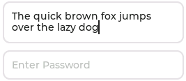
Configuration variables:
- accepted_chars (Optional, string): You can set a list of accepted characters, so other characters will be ignored.
- max_length (Optional, int): Limit the maximum number of characters to this value.
- one_line (Optional, boolean): The text area can be limited to only allow a single line of text. In this case the height will set automatically to fit only one line, line break characters will be ignored, and word wrap will be disabled.
- password_mode (Optional, boolean): The text area supports password mode. By default, if the
•(bullet,0x2022) glyph exists in the font, the entered characters are converted to it after some time or when a new character is entered. If•is missing from the font,*(asterisk) will be used. - text (Optional, Text property): Initial contents of the textarea.
- placeholder_text (Optional, Text property): A placeholder text can be specified, which is displayed when the Text area is empty.
- any Styling and state-based option for the background of the textarea. Uses all the typical background style properties and the text/label related style properties for the text.
Actions:
lvgl.textarea.updateaction updates the widget’stextproperty, to replace the entire text content.- id (Required): The ID or a list of IDs of textarea widgets to be updated.
- text (Optional, Text property): The text to replace the textarea content.
- All other configuration variables from above are optional and have the same function as previously described.
Triggers:
on_valuetrigger is activated on every keystroke.on_readytrigger is activated whenone_lineis configured astrueand the newline character is received (Enter/Ready key on the keyboard).- interaction LVGL event triggers.
For both triggers above, when triggered, the variable text (std::string type) is available for use in lambdas within these triggers and it will contain the entire contents of the textarea.
Example:
# Example widget:
- textarea:
    id: textarea_id
    one_line: true
    placeholder_text: "Enter text here"

# Example action:
on_...:
  then:
    - lvgl.textarea.update:
        id: textarea_id
        text: "Hello World!"

# Example trigger:
- textarea:
    ...
    on_value:
      then:
        - logger.log:
            format: "Textarea changed to: %s"
            args: [ text.c_str() ]
    on_ready:
      then:
        - logger.log:
            format: "Textarea ready: %s"
            args: [ text.c_str() ]
The textarea can be also integrated as Text or Text Sensor component.
tileview
The tileview is a container object whose elements, called tiles, can be arranged in grid form. A user can navigate between the tiles by dragging or swiping. Any direction can be disabled on the tiles individually to not allow moving from one tile to another.
If the tileview is screen sized, the user interface resembles what you may have seen on smartwatches. The tileview has parts main and scrollbar.
Configuration variables:
- tiles (Required, list): A list with (any number of) tiles to be added to tileview.
- column (Required): Vertical position of the tile in the tileview grid.
- row (Required): Horizontal position of the tile in the tileview grid.
- dir (Optional): Enable moving to adjacent tiles in the given direction by swiping/dragging. One (or multiple as YAML list) of
LEFT,RIGHT,TOP,BOTTOM,HOR,VER,ALL. Defaults toALL. - id (Optional): A tile ID to be used with the
lvgl.tileview.selectaction. - widgets (Optional, list): A list of LVGL Widgets to be drawn on the tile, as children.
Actions:
lvgl.tileview.selectaction jumps thetileviewto the desired tile:- animated (Optional, boolean): To animate the movement. Defaults to
false. - column (Optional): Vertical position of the tile to which to jump. Required if not specifying
tile_id. - row (Optional): Horizontal position of the tile to which to jump. Required if not specifying
tile_id. - id (Required): The ID of the tileview which receives this action.
- tile_id (Optional): The ID of the tile (from within the tileview) to which to jump. Required if not specifying
rowandcolumn.
- animated (Optional, boolean): To animate the movement. Defaults to
Triggers:
on_valuetrigger is activated when displayed tile changes. The new value is returned in the variabletileas the ID of the now-visible tile.- interaction LVGL event triggers.
Example:
# Example widget:
- tileview:
    id: tiv_id
    tiles:
      - id: cat_tile
        row: 0
        column: 0
        dir: VER
        widgets:
          - image:
              src: cat_image
          - ...
      - ...

# Example action:
on_...:
  then:
    - lvgl.tileview.select:
        id: tiv_id
        tile_id: cat_tile
        animated: true

# Example trigger:
- tileview:
    ...
    on_value:
      - if:
          condition:
            lambda: return tile == id(cat_tile);
          then:
            - logger.log: "Cat tile is now showing"
Automations
Actions
As outlined in the sections above, each widget type supports several of its own, unique actions. Several universal actions are also available for all widgets, these are outlined below.
lvgl.widget.update
This powerful action allows changing/updating any widget’s common style property, state (templatable) or flag on the fly.
- id (Required): The ID or a list of IDs of widgets configured in LVGL to be updated.
- The widget’s common style property, state (templatable) or flag.
# Example for updating styles (in states):
on_...:
  then:
    - lvgl.widget.update:
        id: my_button_id
        bg_color: 0xFF0000
        state:
          disabled: true

# Example for updating flag:
on_...:
  then:
    - lvgl.widget.update:
        id: my_label_id
        hidden: true
Check out in the Cookbook Remote light button for an example which demonstrates how to use a template to update the state.
lvgl.widget.hide, lvgl.widget.show
These actions are shorthands for toggling the hidden flag of any widget.
- id (Required): The ID or a list of IDs of widgets configured in LVGL which you want to hide or show.
on_...:
  then:
    - lvgl.widget.hide: my_label_id                # a single widget
    - lvgl.widget.show: [my_button_1, my_button_2] # a list of widgets
    - delay: 0.5s
    - lvgl.widget.show:
        -id: my_label_id
    - lvgl.widget.hide:
- id: [my_button_1, my_button_2]lvgl.widget.disable, lvgl.widget.enable
These actions are shorthands for toggling the disabled state of any widget (which controls the appearance of the corresponding disabled style set of the theme):
- id (Required): The ID or a list of IDs of widgets configured in LVGL which you want to disable or enable.
- on_...:
    then:
      - lvgl.widget.disable:
          - my_button_1
          - my_button_2

- on_...:
    then:
      - lvgl.widget.enable:
          - id: my_button_1
          - id: my_button_2
Triggers
Specific triggers like on_value and on_change ` are available for certain widgets; they are described above in their respective section.
Some universal triggers are also available for all of the widgets:
ESPHome implements as universal triggers the following interaction events generated by LVGL:
on_press: The widget has been pressed.on_long_press: The widget has been pressed for at least thelong_press_timespecified in the input device configuration. Not called if scrolled.on_long_press_repeat: Called afterlong_press_timein everylong_press_repeat_timems. Not called if scrolled.on_short_click: The widget was pressed for a short period of time, then released. Not called if scrolled or long pressed.on_click: Called on release if a widget did not scroll (regardless of long press).on_release: Called in every case when a widget has been released.on_scroll_begin: Scrolling of the widget begins.on_scroll_end: Scrolling of the widget ends.on_scroll: The widget was scrolled.on_focus: The widget is focused.on_defocus: The widget is unfocused.on_gesture: A swipe gesture has been detectedon_swipe_left: A left swipe gesture has been detectedon_swipe_right: A right swipe gesture has been detectedon_swipe_up: An upwards swipe gesture has been detectedon_swipe_down: A downwards swipe gesture has been detectedon_swipe_top: Synonym foron_swipe_upon_swipe_bottom: Synonym foron_swipe_downon_all_events: Will be triggered on any event sent to the widget - this is useful for debugging.
These triggers can be applied directly to any widget in the LVGL configuration, given that the widget itself supports generating such events. For the widgets having a value, the triggers return the current value in variable x ; this variable may be used in lambdas defined within those triggers.
Each trigger also deliver an event parameter, which is a pointer to the LVGL C type lv_event_t. This may be used in lambdas defined within those triggers. Refer to the LVGL documentation for more information.
There are additional triggers for pages - each page may have an on_load and on_unload trigger. These will be called
when the page becomes active or inactive respectively.
# Example triggers:
- button:
    ...
    on_short_click:
      then:
        lvgl.page.show: main_page
    on_long_press:
      then:
        light.toggle: display_backlight

- slider:
    ...
    on_release:
      then:
        - light.turn_on:
            id: display_backlight
            transition_length: 0ms
            brightness: !lambda return x / 100;
on_boot
This trigger is triggered after LVGL has been setup. It is available on the lvgl component and any widget and can be used to perform any LVGL related setup that is not possible with static configuration.
When used on a widget, it does not act specifically on that widget but can be used to keep actions related to that widget together with its configuration.