LVGL Graphics
LVGL (Light and Versatile Graphics Library) is a free and open-source embedded graphics library to create beautiful UIs for any MCU, MPU and display type. ESPHome supports LVGL version 8.
Prerequisites

To use LVGL with a display in ESPHome, you’ll need an ESP32 or RP2040. PSRAM is not a strict requirement but it is generally recommended, especially for large color displays.
The graphic display should be configured with auto_clear_enabled: false and should not have any lambda set.
The LVGL component will take care of the display rendering. For most displays, the update_interval should be
set to never, but note that some displays such as OLED and e-paper will need the update interval set to a suitable
interval, or make use of the on_draw_end trigger to manually update the display.
For interactivity, a Touchscreen (capacitive highly preferred), a Rotary Encoder Sensor or a custom keypad made up from discrete Binary Sensors can be used.
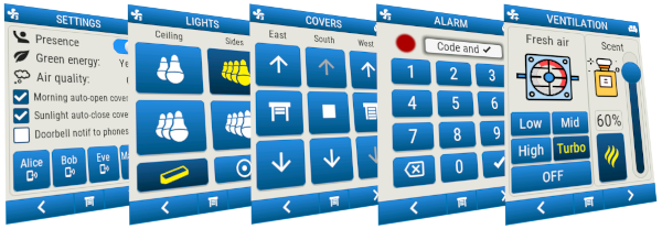
Check out the detailed examples in the Cookbook which demonstrate a number of ways you can integrate your environment with LVGL and ESPHome.
TL;DR
To get started, it is sufficient to add a display and an empty LVGL configuration. If neither pages nor widgets is specified, then a default “hello world” page will be shown.
# Example minimal configuration entry
lvgl:

display:
  - platform: ...
    # ...
    auto_clear_enabled: false
    update_interval: never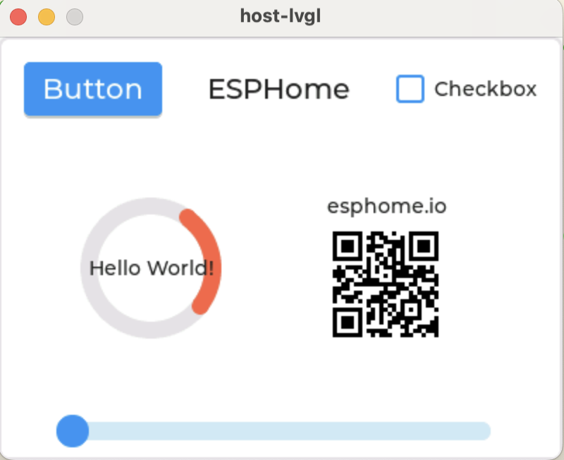
To make LVGL your own you will need to add widgets to the display. For example, to show a label with the text “Hello World!” in the center of the screen:
lvgl:
  widgets:
    - label:
        align: CENTER
        text: 'Hello World!'
Now read on to learn more about the configuration options and how to customize your LVGL display.
Basics
In LVGL, graphical elements like buttons, labels, sliders, etc. are called widgets or objects. See LVGL Widgets for a complete list of widgets supported within ESPHome. Not all LVGL widgets are implemented, just those commonly used to support home automation needs/tasks.
Every widget has a parent object where it is created. For example, if a label is created on a button, the button is the parent of the label. Complex widgets internally consist of several smaller/simpler widgets; these are known as parts, each of which can have separate properties from the main widget.
Pages in ESPHome are implemented as LVGL screens, which are special objects which have no parent. There is always one active page on a display.
Widgets can be assigned with an ID so that they can be referenced in automations.
Some widgets integrate also as native ESPHome components:
| LVGL Widget | ESPHome component |
|---|---|
button | Switch, Binary Sensor |
switch , checkbox | Switch |
slider, arc, spinbox | Number, Sensor |
dropdown, roller | Select |
label, textarea | Text, Text Sensor |
led | Light |
These are useful with Home Assistant automations interacting directly with the widgets.
Main Configuration
Although LVGL is a complex matrix of objects-parts-states-styles, ESPHome simplifies this into a hierarchy.
At the highest level of the LVGL object hierarchy is the display (represented by the hardware driver). A display can have one or more pages associated with it. Each page contains a hierarchy of objects for graphical widgets representing a layout to be presented on the display.
The following configuration variables apply to the main lvgl component, in order to establish the principal operating conditions. Some styling options can be set at this level too, but only for inheritance purposes.
Configuration variables:
- displays (Optional, list, ID): A list of display IDs where LVGL should perform rendering based on its configuration. This may be omitted if there is a single display configured, which will be used automatically.
- touchscreens (Optional, list): A list of touchscreens interacting with the LVGL widgets on the display. If you configure a single touchscreen it will be used automatically, and this config entry will not be required.
- touchscreen_id (Required, ID): ID of a touchscreen configuration related to a display.
- long_press_time (Optional, Time): For the touchscreen, delay after which the
on_long_pressedinteraction trigger will be called. Defaults to400ms. - long_press_repeat_time (Optional, Time): For the touchscreen, repeated interval after
long_press_time, whenon_long_pressed_repeatinteraction trigger will be called. Defaults to100ms.
- encoders (Optional, list): A list of rotary encoders interacting with the LVGL widgets on the display.
- group (Optional, string): A name for a group of widgets which will interact with the the input device. See the common properties of the widgets for more information on groups.
- initial_focus (Optional, ID): An optional ID for a widget to be given focus on startup (especially useful if there is only one focusable widget.)
- enter_button (Required, ID): The ID of a Binary Sensor, to be used as
ENTERkey. - sensor (Optional, ID): The ID of a Rotary Encoder Sensor; or a list with buttons for left/right interaction with the widgets:
- left_button (Optional, ID): The ID of a Binary Sensor, to be used as
LEFTkey. - right_button (Optional, ID): The ID of a Binary Sensor, to be used as
RIGHTkey.
- left_button (Optional, ID): The ID of a Binary Sensor, to be used as
- long_press_time (Optional, Time): For the rotary encoder, delay after which the
on_long_pressedinteraction trigger will be called. Defaults to400ms. Can be disabled withnever. - long_press_repeat_time (Optional, Time): For the rotary encoder, repeated interval after
long_press_time, whenon_long_pressed_repeatinteraction trigger will be called. Defaults to100ms. Can be disabled withnever.
- keypads (Optional, list): A list of keypads interacting with the LVGL widgets on the display.
- group (Optional, string): A name for a group of widgets which will interact with the the input device. See the common properties of the widgets for more information on groups.
- up (Optional, ID): The ID of a Binary Sensor, to be used as
UPkey. - down (Optional, ID): The ID of a Binary Sensor, to be used as
DOWNkey. - right (Optional, ID): The ID of a Binary Sensor, to be used as
RIGHTkey. - left (Optional, ID): The ID of a Binary Sensor, to be used as
LEFTkey. - esc (Optional, ID): The ID of a Binary Sensor, to be used as
ESCkey. - del (Optional, ID): The ID of a Binary Sensor, to be used as
DELkey. - backspace (Optional, ID): The ID of a Binary Sensor, to be used as
BACKSPACEkey. - enter (Optional, ID): The ID of a Binary Sensor, to be used as
ENTERkey. - next (Optional, ID): The ID of a Binary Sensor, to be used as
NEXTkey. - prev (Optional, ID): The ID of a Binary Sensor, to be used as
PREVkey. - home (Optional, ID): The ID of a Binary Sensor, to be used as
HOMEkey. - end (Optional, ID): The ID of a Binary Sensor, to be used as
ENDkey. - long_press_time (Optional, Time): For the keypad, delay after which the
on_long_pressedinteraction trigger will be called. Defaults to400ms. Can be disabled withnever. - long_press_repeat_time (Optional, Time): For the keypad, repeated interval after
long_press_time, whenon_long_pressed_repeatinteraction trigger will be called. Defaults to100ms. Can be disabled withnever.
✅ Tip
When using binary sensors (from physical keys) to interact with LVGL, if there are only three keys available, they are best used when configured as a rotary encoder, where
LEFTandRIGHTact like the rotary wheel, andENTERgenerates anon_presstrigger. With four or more keys, a keypad configuration is generally more appropriate. For example, a keypad consisting of five keys might usePREV,NEXT,UP,DOWNandENTER;PREV/NEXTare used to select a widget within the group,UP/DOWNchanges the selected value andENTERgenerates anon_presstrigger.The
long_press_timeandlong_press_repeat_timecan be fine-tuned also by setting them toneverand using theautorepeatfilter on each binary sensor separately.
✅ Tip
When using an encoder input device the navigation works as follows:
- By turning the encoder you can focus on the next/previous object.
- When you press the encoder on a simple object (like a button), it will be clicked.
- If you press the encoder on a complex object (like a list, message box, etc.) the object will go to edit mode whereby you can adjust the value of the object by turning the encoder.
- To leave edit mode, long press the button.
- resume_on_input (Optional, boolean): If LVGL is paused and the user interacts with the screen, resume the activity of LVGL. Defaults to
true. “Interacts” means to release a touch or button, or rotate an encoder. - color_depth (Optional, string): The color depth at which the contents are generated. Currently only
16is supported (RGB565, 2 bytes/pixel), which is the default value. - buffer_size (Optional, percentage): The percentage of screen size to allocate buffer memory. If unconfigured, the default is
100%with runtime fallback to12%if a full size buffer allocation fails. For devices without PSRAM, the recommended value is25%. - draw_rounding (Optional, int): An optional value to use for rounding draw areas to a specified boundary. Defaults to 2. Useful for displays that require draw windows to be on specified boundaries (usually powers of 2.)
- log_level (Optional, string): Set the logger level specifically for the messages of the LVGL library:
TRACE,INFO,WARN,ERROR,USER,NONE. Defaults toWARN. - byte_order (Optional, int16): The byte order of the data LVGL outputs; either
big_endianorlittle_endian. Defaults tobig_endian. - disp_bg_color (Optional, color): Solid color used to fill the background. Can be changed at runtime with the
lvgl.updateaction. - disp_bg_image (Optional, image): The ID of an existing image configuration, to be used as background wallpaper. To change the image at runtime use the
lvgl.updateaction. Also seeimagefor a note regarding supported image formats. May also be set tononeto clear the background image.` - disp_bg_opa (Optional, opacity): Opacity of the background image or color of the display.
- default_font (Optional, ID): The ID of the font used by default to render the text or symbols. Defaults to LVGL’s internal
montserrat_14if not specified. - style_definitions (Optional, list): A batch of style definitions to use in LVGL widget’s
stylesconfiguration. See below for more details. - gradients (Optional, list): A list of gradient definitions to use in bg_grad styles. See below for more details.
- theme (Optional, list): A list of styles to be applied to all widgets. See below for more details.
- widgets (Optional, list): A list of LVGL Widgets to be drawn on the root display. May not be used if
pages(below) is configured. - pages (Optional, list): A list of page IDs. Each page acts as a parent for widgets placed on it. May not be used with
widgets(above). Options for each page:- skip (Optional, boolean): Option to skip this page when navigating between them with
lvgl.page.next,lvgl.page.previous. - layout (Optional): See Layouts for details. Defaults to
NONE. - widgets (Optional, list): A list of LVGL Widgets to be drawn on the page.
- All other options from Style properties to be applied to this page.
- skip (Optional, boolean): Option to skip this page when navigating between them with
- page_wrap (Optional, boolean): Wrap from the last to the first page when navigating between them with
lvgl.page.next,lvgl.page.previous. Defaults totrue. - top_layer (Optional, list): A special kind of Always on Top page, which acts as a parent for widgets placed on it. It’s shown above all the pages, which may be useful for widgets which always need to be visible.
- layout (Optional): See Layouts for details. Defaults to
NONE. - widgets (Optional, list): A list of LVGL Widgets to be drawn on the page.
- All other options from Style properties to be applied to this page.
- layout (Optional): See Layouts for details. Defaults to
- layout (Optional): See Layouts for details. Defaults to
NONE. - All other options from Style properties to be applied to all widgets directly.
Example:
# Example configuration entry
lvgl:
  displays:
    - my_display
  pages:
    - id: main_page
      widgets:
        - label:
            align: CENTER
            text: 'Hello World!'
See Page navigation footer in the Cookbook for an example which demonstrates how to implement a page navigation bar at the bottom of the screen.
Choosing a buffer size
The buffer_size option is a percentage of the display size. For example, if you have a 320x240 display, the buffer size is 320 * 240 * 2 bytes (for RGB565) = 153600 bytes. If you set the buffer size to 50%,
then the buffer will be 76800 bytes. If you set it to 25%, then the buffer will be 38400 bytes. The default value is 100%.
When using larger displays on devices with limited RAM (i.e. no PSRAM), you may want to reduce the buffer size to avoid running out of RAM. If not specified, the buffer size will be 100%, but a fallback at runtime to 12% will be attempted if a full size buffer fails. If a specific buffer size is set, the fallback will not be attempted. A failure to allocate a buffer will result in an error message in the log and the LVGL component being marked “Failed”.
Generally speaking a larger buffer will provide better performance, but the effect of reducing the buffer size from 100% is not as bad as you might think. The LVGL library is designed to be efficient and will only redraw the parts of the screen that have changed.
A buffer size less than 100% can also be useful when PSRAM is available to improve performance. In this case a buffer size of 12% is recommended, and it will be allocated in internal RAM if possible, which will increase the speed of display redraws, since internal RAM is much faster to access than PSRAM. This may however reduce the internal RAM available for other components. A buffer size greater than 25% will be always allocated in PSRAM if available.
Multiple LVGL configurations
If you have multiple displays configured, and wish to have different content displayed on each display, you can configure multiple LVGL configurations. For example:
lvgl:
  - id: lvgl_1
      displays: display_1
      widgets:
        - label:
            text: 'Hello World #1!'
  - id: lvgl_2
      displays: display_2
      widgets:
        - label:
            text: 'Hello World #2!'
Colors
Colors can be specified anywhere in the LVGL configuration either by referencing a preconfigured ESPHome color ID or by representing the color in the common hexadecimal notation. For example, 0xFF0000 would be red.
You may also use any of the standard CSS color names, e.g. springgreen.
When using a lambda to provide a color you can use the lv_color_hex function to convert a hex value, or
return a Color ID - this is useful when using the Mapping Component. Examples:
label:
  id: my_label
  text: 'Hello World!'
  color: !lambda return lv_color_hex(0xFF0000);

on_...:
    lvgl.label.update:
      id: my_label
      text: 'Hello Mars!'
      color: !lambda return id(mapping_color_map)[x];
Opacity
Various parts of the widgets (like background, borders etc.) support opacity. It can be specified in one of several ways:
- As a string:
TRANSPfor fully transparent,COVERfor fully opaque - As a floating point value in the range 0.0-1.0
- As a percentage between
0%and100%. - From a lambda - return an integer in the range 0-255.
Default values depend on widget specifics.
Fonts
Two font choices are available:
ESPHome fonts
You can use fonts configured normally, the glyphs will be rendered while building the binary. This has the advantage that you can define custom sets of glyphs of any size, with icons or diacritic characters of your choice, for any language, from any TrueType/OpenType font, allowing a more optimal flash space usage because you don’t need to include all glyphs for all sizes you wish to use.
✅ Tip
For best results, set
bpp: 4to get the glyphs rendered with proper anti-aliasing.
Check out MDI icons in text, Toggle state icon button and Battery status icon in the Cookbook for examples which demonstrate how to use icons and text with TrueType/OpenType fonts.
Library fonts
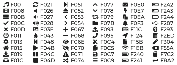
The LVGL library offers by default prerendered sets with ASCII characters (0x20-0x7F ), the degree symbol (0xB0 ), the bullet symbol (0x2022 ) from Montserrat Medium, and 60 symbols from FontAwesome (see below). You can use the IDs below when specifying the text_font parameter:
montserrat_8: 8px fontmontserrat_10: 10px fontmontserrat_12: 12px fontmontserrat_14: 14px font (default, included ifdefault_fontoption is missing)montserrat_16: 16px fontmontserrat_18: 18px fontmontserrat_20: 20px fontmontserrat_22: 22px fontmontserrat_24: 24px fontmontserrat_26: 26px fontmontserrat_28: 28px fontmontserrat_30: 30px fontmontserrat_32: 32px fontmontserrat_34: 34px fontmontserrat_36: 36px fontmontserrat_38: 38px fontmontserrat_40: 40px fontmontserrat_42: 42px fontmontserrat_44: 44px fontmontserrat_46: 46px fontmontserrat_48: 48px font
The binary will only include any of the above if used in the configuration.
You can display the embedded symbols among the text by their codepoint address preceded by \u. For example: \uF00C :
ℹ️ Note
The
text_fontparameter affects the size of symbols, since all the built-in font arrays based on Montserrat include these symbols at the respective sizes. If you settext_fonton a widget to a custom ESPHome font, these symbols will likely not display, unless you include them manually from a FontAwesome OpenType file.For escape sequences to work, you have to put them in strings enclosed in double quotes.
In addition to the above, the following special fonts are available from LVGL as built-in:
unscii_8: 8 px pixel perfect font with only ASCII characters.unscii_16: 16 px pixel perfect font with only ASCII characters.simsun_16_cjk: 16 px font with normal range + 1000 most common CJK Radicals.dejavu_16_persian_hebrew: 16 px font with normal range + Hebrew, Arabic, Persian letters and all their forms.
Style properties
LVGL follows CSS’s border-box model. A widget’s box is built from the following parts:
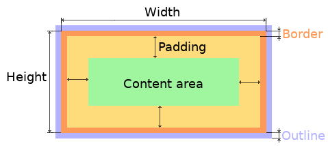
- bounding box: the box defined with
widthandheightof the widgets (pixels or parent content area percentage; not drawn, just for calculations). - border: the border line, drawn on the inner side of the bounding box (pixels).
- outline: the outline, drawn on the outer side of the bounding box (pixels).
- padding: space to keep between the border of the widget and its content or children (I don’t want my children too close to my sides, so keep this space).
- content: the content area which is the size of the bounding box reduced by the border width and padding (it’s what’s referenced as the
SIZE_CONTENToption of certain widgets).
You can adjust the appearance of widgets by changing their foreground, background, border color and/or font. Some widgets allow for more complex styling, effectively changing all or part of their appearance.
Using Lambdas for Styling
Most LVGL style and widget properties can be set as either constant values or lambdas (which will be evaluated at run time). When using lambdas, the returned value must be of the type and within the range expected by the native LVGL library, which may not be the same as is used in YAML. This applies particularly to any value represented as a floating point number - the LVGL library does not use floating point, instead uses scaled integers. Properties with the following native types should be noted:
- opacity LVGL opacity is an integer between 0 and 255.
- brightness Similarly, an integer from 0 to 255.
- angle LVGL angles are represented in 1/10 degree, so usually in the range 0 - 3600.
- color LVGL uses an internal color type - to construct a color in a lambda use
lv_color_hex(0xRRGGBB). - zoom Zoom levels should be multiplied by 256 (valid range is 0 to 2560, corresponding to 0-10.0).
- percentage To convert a fractional value to a percentage, use
lv_pct(value * 100)
Style properties
These style properties may be applied to any widget, though not all widgets use all of them.
- bg_color (Optional, color): Color for the background of the widget. Defaults to
0xFFFFFF(white). - bg_grad (Optional, gradient): A gradient to apply to the background.
- bg_grad_color (Optional, color): Color to make the background gradually fade to. Defaults to
0(black). - bg_dither_mode (Optional, dict): Set dithering of the background gradient. One of
NONE,ORDERED,ERR_DIFF. Defaults toNONE. - bg_grad_dir (Optional, dict): Choose the direction of the background gradient:
NONE,HOR,VER. Defaults toNONE. - bg_main_stop (Optional, 0-255): Specify where the gradient should start:
0= upper left,128= in the center,255= lower right. Defaults to0. - bg_grad_stop (Optional, 0-255): Specify where the gradient should stop:
0= upper left,128= in the center,255= lower right. Defaults to255. - opa (Optional, opacity): Opacity of the entire widget. Inherited from parent. Defaults to
COVER. - bg_opa (Optional, opacity): Opacity of the widget background.
- opa_layered (Optional, opacity): Opacity of the entire layer the widget is on. Inherited from parent. Defaults to
COVER. - bg_image_src (Optional, image): The ID of an existing image configuration, to show as the background of the widget.
- bg_image_opa (Optional, opacity): Opacity of the background image of the widget.
- bg_image_recolor (Optional, color): Color to mix with every pixel of the background image of the widget.
- bg_image_recolor_opa (Optional, opacity): Opacity of the recoloring of the background image of the widget.
- border_width (Optional, int16): Set the width of the border in pixels. Defaults to
0. - border_color (Optional, color): Color to draw borders of the widget. Defaults to
0(black). - border_opa (Optional, opacity): Opacity of the borders of the widget. Defaults to
COVER. - border_post (Optional, boolean): If
truethe border will be drawn after all children of the widget have been drawn. Defaults tofalse. - border_side (Optional, list): Select which borders of the widgets to show (multiple can be specified as a YAML list, defaults to
NONE):NONETOPBOTTOMLEFTRIGHTINTERNAL
- clip_corner (Optional, boolean): If set to
true, overflowing content will be clipped off by the widget’s rounded corners (radius>0). - color_filter_opa (Optional, opacity): Opacity of the color filter. Currently color filters are applied only by the default LVGL theme, this option allows the effect of those to be disabled by setting to
TRANSP. - image_recolor (Optional, color): Color to mix with every pixel of an image Note that
image_recolor_opadefaults to TRANSP, so it must also be set. - image_recolor_opa (Optional, opacity): Opacity of the image recoloring.
- outline_width (Optional, int16): Set the width of the outline in pixels. Defaults to
0. - outline_color (Optional, color): Color used to draw an outline around the widget. Defaults to
0(black). - outline_opa (Optional, opacity): Opacity of the outline of the widget. Defaults to
COVER. - outline_pad (Optional, int16): Distance between the outline and the widget itself. Defaults to
0. - pad_all (Optional, int16): Set the padding in all directions, in pixels.
- pad_top (Optional, int16): Set the padding on the top, in pixels.
- pad_bottom (Optional, int16): Set the padding on the bottom, in pixels.
- pad_left (Optional, int16): Set the padding on the left, in pixels.
- pad_right (Optional, int16): Set the padding on the right, in pixels.
- pad_row (Optional, int16): Set the padding between the rows of the children elements, in pixels.
- pad_column (Optional, int16): Set the padding between the columns of the children elements, in pixels.
- radius (Optional, uint16): The radius to be used to form the widget’s rounded corners. 0 = no radius (square corners); 65535 (max) = pill shaped widget (true circle if it has same width and height, radius then should be set to half the width/height).
- shadow_color (Optional, color): Color used to create a drop shadow under the widget. Defaults to
0(black). - shadow_ofs_x (Optional, int16): Horizontal offset of the shadow, in pixels. Defaults to
0. - shadow_ofs_y (Optional, int16): Vertical offset of the shadow, in pixels. Defaults to
0. - shadow_opa (Optional, opacity): Opacity of the shadow. Defaults to
COVER. - shadow_spread (Optional, int16): Spread of the shadow, in pixels. Defaults to
0. - shadow_width (Optional, int16): Width of the shadow, in pixels. Defaults to
0. - transform_angle (Optional, 0-360): Transformation angle of the widget (eg. rotation)
- transform_height (Optional, int16 or percentage): Transformation height of the widget (eg. stretching)
- transform_pivot_x (Optional, int16): Horizontal anchor point of the transformation. Relative to the widget’s top left corner.
- transform_pivot_y (Optional, int16): Vertical anchor point of the transformation. Relative to the widget’s top left corner.
- transform_zoom (Optional, 0.1-10): Transformation zoom of the widget (eg. resizing)
- translate_x (Optional, int16 or percentage): Movement of the widget with this value in horizontal direction.
- translate_y (Optional, int16 or percentage): Movement of the widget with this value in vertical direction.
Themes
You can configure a global theme for all widgets of a given type at the top level with the theme: configuration variable. In the example below, all the arc, slider and button widgets will, by default, use the styles and properties defined here. A combination of styles and states can be chosen for every widget.
lvgl:
  theme:
    arc:
      scroll_on_focus: true
      group: general
    slider:
      scroll_on_focus: true
      group: general
    button:
      scroll_on_focus: true
      group: general
      border_width: 2
      outline_pad: 6
      pressed:
        border_color: 0xFF0000
      checked:
        border_color: 0xFFFF00
      focused:
        border_color: 0x00FF00
Naturally, you can override these at the individual configuration level of each widget. This can be done in batches, using the style_definitions configuration variable of the main component.
In the example below, you defined date_style :
lvgl:
  style_definitions:
    - id: date_style      # choose an ID for your definition
      text_font: unscii_8
      align: center
      text_color: 0x000000
      bg_opa: cover
      radius: 4
      pad_all: 2
And then you apply these selected styles to two labels, and only change very specific style y locally:
widgets:
  - label:
      id: day_label
      styles: date_style # apply the definition here by the ID chosen above
      y: -20
  - label:
      id: date_label
      styles: date_style
      y: +20
Additionally, you can change the styles based on the state property of the widgets or their parts. If you want to set a property for all states (e.g. red background color) just set it for the default state at the root of the widget. If the widget can’t find a property for its current state it will fall back to this.
In the example below, you have an arc with some styles set here. Note how you change the arc_color of the indicator part, based on state changes:
- arc:
    id: my_arc
    value: 75
    min_value: 1
    max_value: 100
    indicator:
      arc_color: 0xF000FF
      pressed:
        arc_color: 0xFFFF00
      focused:
        arc_color: 0x808080
So the precedence happens like this: state based styles override the locally specified styles, which override the style definitions, which override the theme, which overrides the top level styles. The value precedence of states is quite intuitive and it’s something the user would expect naturally. For example, if a widget is focused the user will still want to see if it’s pressed, therefore the pressed state has a higher precedence. (If the focused state had a higher precedence it would override the pressed color, defeating its purpose.)
Feel free to experiment to discover inheritance and precedence of the styles based on states between the nested widgets.
Theme and style definitions The Cookbook contains an example which demonstrates how to implement a gradient style for your widgets.
lvgl.style.update
This action allows changing/updating the properties of a style at run time. This can be used to implement dynamic themes, e.g. light/dark mode, or to change the appearance of widgets based on user interaction.
The action takes a style ID and a dictionary of properties to update. The properties can be any of the style properties listed above, and can be constants or lambdas.
# Example configuration entry
lvgl:
  style_definitions:
    - id: my_style
      bg_color: 0xFFFFFF
      border_color: 0x000000
      border_width: 2

# Action to update the style
on_...:
  - lvgl.style.update:
      id: my_style
      bg_color: 0xFF0000
      border_color: 0x00FF00
Gradients
A gradient is a sequence of colors which can be applied to an object using the bg_grad style option. Gradients are defined in the gradients section of the LVGL configuration by providing two or more color stop points.
Each entry has the following options:
- id (Required, ID): The ID with which you will be able to reference the gradient later.
- direction (Optional, string): The direction of the gradient. Possible options are
none(the default)hororver. - dither (Optional, string): A dithering selection. Possible options are
none(the default)err_difforordered. - stops (Required, list): A list of at least 2 color stop points. Each stop point has the following options:
- color (Required, Color): The color of the stop point.
- position (Required, float): The position of the stop point. Must be a float between 0.0 and 1.0, a percentage between 0% and 100%, or an integer between 0 and 255.
# Example gradient showing full hue range.

  gradients:
    - id: color_bar
      direction: hor
      dither: none
      stops:
        - color: 0xFF0000
          position: 0
        - color: 0xFFFF00
          position: 42
        - color: 0x00FF00
          position: 84
        - color: 0x00FFFF
          position: 127
        - color: 0x0000FF
          position: 169
        - color: 0xFF00FF
          position: 212
        - color: 0xFF0000
          position: 255
Widgets
LVGL supports a list of LVGL Widgets which can be used to draw interactive objects on the screen.
Actions
Widgets support general or specific actions - see the LVGL Widgets section for more information.
Several actions are available for the LVGL component itself, these are outlined below. Note that if multiple LVGL instances are configured, an lvgl_id config entry will be required to specify which instance the action relates to. This is not required if there is only a single LVGL instance configured.
lvgl.widget.redraw
This action redraws the entire screen, or optionally only selected widgets. It does not change any widget properties. It is mostly useful to redraw the screen after resuming LVGL from the paused state.
- id (Optional): The ID (or a list of IDs) of a widget configured in LVGL which you want to redraw; if omitted, the entire screen will be redrawn.
- lvgl_id (Optional): The ID of the LVGL instance to redraw.
on_...:
  then:
    - lvgl.widget.redraw:
        lvgl_id: lvgl1  # optional when only one LVGL instance is configured
lvgl.widget.refresh
This action re-evaluates all properties specified with lambdas in the specified widget’s configuration. This offers
an alternative technique to using the lvgl.widget.update action, which updates specified properties.
- id (Required): The ID of a widget configured in LVGL to refresh (may also be a list of widgets).
Only properties with lambdas are refreshed. A build-time error will be raised if the widget has no lambda properties.
widgets:
  - label:
      id: label1
      text: !lambda return id(text_sensor).state;

on_...:
  then:
    - lvgl.widget.refresh: label1 # will update the label text using the lambda.
lvgl.pause
This action pauses the activity of LVGL, including rendering.
- show_snow (Optional, boolean): When paused, display random colored pixels across the entire screen in order to minimize screen burn-in, to relief the tension put on each individual pixel. See Prevent burn-in of LCD for an example which demonstrates how to use this.
- lvgl_id (Optional): The ID of the LVGL instance to pause.
on_...:
  then:
    - lvgl.pause:
        show_snow: true
lvgl.resume
This action resumes the activity of LVGL, including rendering.
- lvgl_id (Optional): The ID of the LVGL instance to resume.
on_...:
  then:
    - lvgl.resume:
lvgl.update
This action allows changing/updating the disp_bg_color or disp_bg_image configuration variables of the main component, making it possible to change the background color or wallpaper at any time.
# Examples:
on_...:
  then:
    - lvgl.update:
        disp_bg_color: 0x0000FF
    - lvgl.update:
disp_bg_image: cat_imagelvgl.page.next, lvgl.page.previous
This action changes the page to the next/previous based on the configuration (pages with their skip option enabled are…skipped). Page changes will wrap around at the end.
- animation (Optional): Animate page changes as specified. One of:
NONE,OVER_LEFT,OVER_RIGHT,OVER_TOP,OVER_BOTTOM,MOVE_LEFT,MOVE_RIGHT,MOVE_TOP,MOVE_BOTTOM,FADE_IN,FADE_OUT,OUT_LEFT,OUT_RIGHT,OUT_TOP,OUT_BOTTOM. Defaults toNONE. - time (Optional, Time): Duration of the page change animation. Defaults to
50ms.
on_...:
  then:
    - lvgl.page.next:
        animation: OUT_LEFT
        time: 300ms

on_...:
  then:
    - lvgl.page.previous:
        animation: OUT_RIGHT
        time: 300ms
lvgl.page.show
This action shows a specific page (including pages with their skip option enabled).
- id (Required): The ID of the page to be shown.
- animation (Optional): Animate page changes as specified. One of:
NONE,OVER_LEFT,OVER_RIGHT,OVER_TOP,OVER_BOTTOM,MOVE_LEFT,MOVE_RIGHT,MOVE_TOP,MOVE_BOTTOM,FADE_IN,FADE_OUT,OUT_LEFT,OUT_RIGHT,OUT_TOP,OUT_BOTTOM. Defaults toNONE. - time (Optional, Time): Duration of the page change animation. Defaults to
50ms.
on_...:
  then:
    - lvgl.page.show:
        id: secret_page

on_...:
  then:
    - lvgl.page.show: secret_page  # shorthand version
lvgl.widget.focus
This action moves the input focus to the nominated widget. Used mainly with encoder inputs to select a specific widget to receive input events. It may also allow the focus to be frozen on that widget, or can be used to move the focus to the next or previous widget in the focus group.
The required config options take one of several forms:
- id (Required): The ID of the widget to be given focus.
- freeze (Optional, boolean): If true will lock the focus to this widget.
- editing (Optional, boolean): Sets the editing mode of the widget, i.e. encoder rotation will change the value of the widget, not move the focus. Defaults to false.
or
- action (Required): Should be one of
next,previous,markorrestore. - group (Optional): The ID of the group within which to move the focus. The default group will be used if not specified
- freeze (Optional, boolean): If true will lock the focus to the now selected widget.
The next and previous actions will move the focus to the next or previous widget within the group.
The mark action will save the currently focused widget within the group, and restore it when the restore action is triggered.
on_...:
  then:
    - lvgl.widget.focus:
        id: my_button
        freeze: true

on_...:
  then:
    - lvgl.widget.focus: my_button

on_...:
  then:
    - lvgl.widget.focus:
        group: encoder_group
        direction: next
        freeze: true

on_...:
  then:
    - lvgl.widget.focus: previous
Conditions
lvgl.is_idle
This condition checks if the amount of time specified has passed since the last touch event.
- timeout (Required, templatable, int): Amount of time expected since the last touch event.
- lvgl_id (Optional): The ID of the LVGL instance to monitor.
# In some trigger:
on_...:
  then:
    - if:
        condition:
          lvgl.is_idle:
            timeout: 5s
        then:
          - light.turn_off:
              id: display_backlight
              transition_length: 3s
lvgl.is_paused
This condition checks if LVGL is in the paused state or not.
- lvgl_id (Optional): The ID of the LVGL instance to monitor.
# In some trigger:
on_...:
  then:
    - if:
        condition: lvgl.is_paused
        then:
          - lvgl.resume:
lvgl.page.is_showing
This condition checks if the nominated page is the one currently showing.
- id (Required): The ID of the page to check. May be supplied as a simple value.
# In some trigger:
on_...:
  then:
    - if:
        condition:
          lvgl.page.is_showing: main_page
        then:
          - logger.log: "Main page is showing"
Triggers
Widget level interaction triggers are available, plus a few for the LVGL component itself:
on_idle
LVGL has a notion of screen inactivity – i.e. the time since the last user interaction with the screen is tracked. This can, for example, be used to dim the display backlight or turn it off after a moment of inactivity (like a screen saver). Every use of an input device (touchscreen, rotary encoder) counts as an activity and resets the inactivity counter.
The on_idle triggers are activated when inactivity time becomes longer than the specified timeout. You can configure any desired number of timeouts with different actions.
- timeout (Required, templatable, int): Time that has elapsed since the last touch event, after which the trigger will be invoked.
lvgl:
  ...
  on_idle:
    - timeout: 30s
      then:
        - lvgl.page.show: main_page
    - timeout: 60s
      then:
        - light.turn_off: display_backlight
        - lvgl.pause:
See Turn off screen when idle for an example which demonstrates how to implement screen saving with idle settings.
on_pause
This trigger is triggered when LVGL is paused. This can be used to perform any desired actions when the screen is locked, such as turning off the display backlight.
on_resume
This trigger is triggered when LVGL is resumed. This can be used to perform any desired actions when the screen is unlocked, such as turning on the display backlight.
on_boot
This trigger is triggered after LVGL has been setup. It is also available on any widget, but the timing is the same.
on_draw_start
This trigger is executed before each LVGL drawing operation.
on_draw_end
This trigger is executed after LVGL has completed drawing all updated screen elements. It may be used for example to trigger an update of a display component like an e-paper screen that requires the buffer to be sent to the display for it to be updated.
lvgl:
  on_draw_end:
    component.update: my_display_id